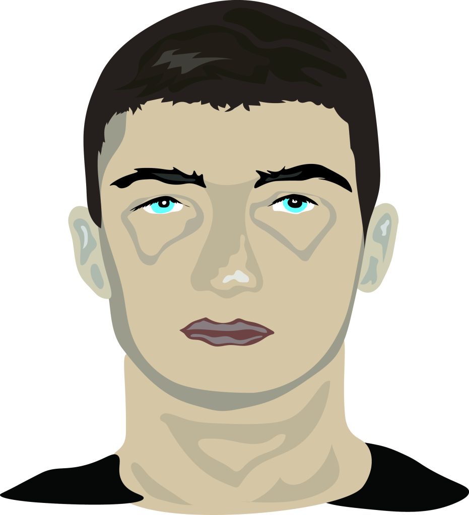

As the title states these portraits were created using Adobe Illustrator both of those portraits are vector portraits and a vector portrait is a minimalistic abstract illustration made up of basic shapes and colours stacked on top of each other creating one final illustration. For the first portrait, I wanted to make it realistic I decided to go with different shades of brown for the whole of the portrait as brown is a natural tone that represents stability and strength this sets a powerful scene for the whole of the edit and this is emphasised by the close up shot of my face overall creating a very strong foundation and this interlinks with the idea of my theme in my next assignment of abstract brutalism.
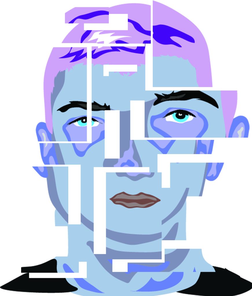
For the second portrait I went with a completely new approach I wanted to make something unexpected. I went on to change the colours from browns to more vibrant colours that pop I mainly focused on blues and purples which symbolise the idea of royalty and I found this to go hand with hand of the idea that my home town was a war city that has gone through a lot of struggles in the past from years of non-existence to benign occupied my different countries and I take a lot of pride and dignity when it comes to that city therefore, I use colours like such. However, I still lacked a unique outcome so I went on to play around with the arrangement of the portrait by cutting, adding and spacing segments of the portraits all over the canvas almost forming a surreal cubist effect from the portrait.
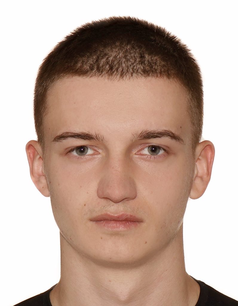
Figure Reference – Personal Photograph- Jakub Strzepek [Accessed 20 November]
