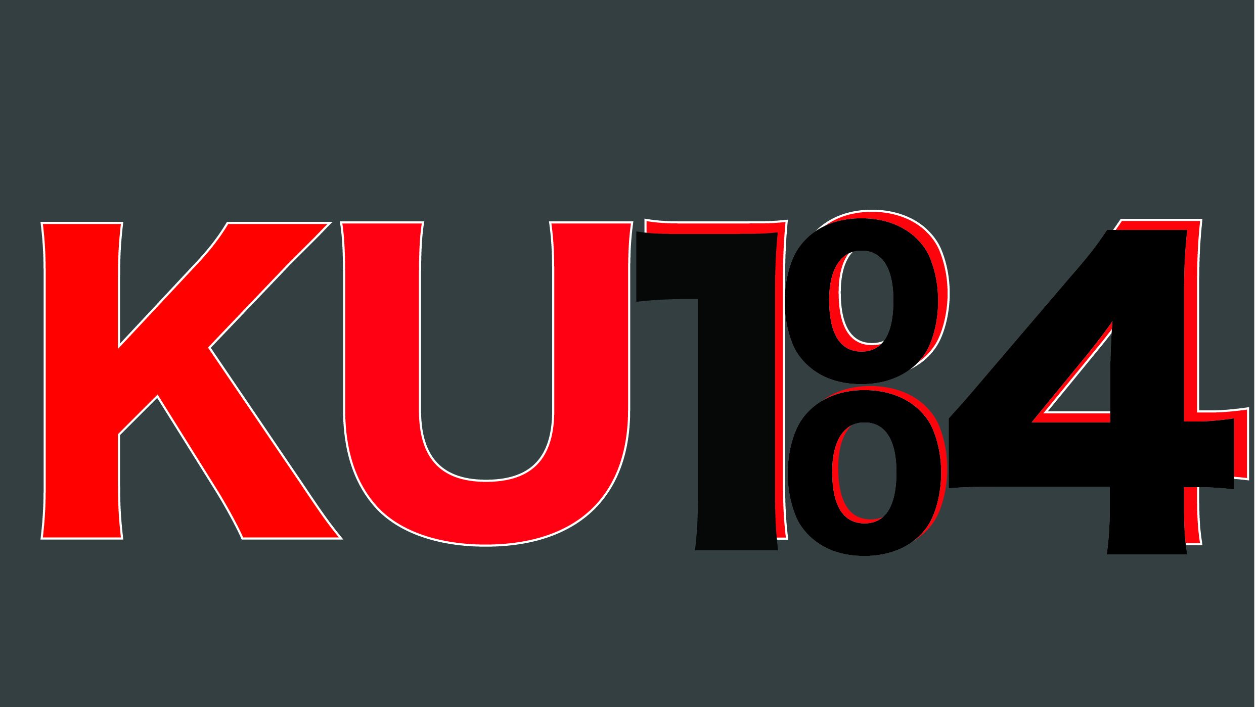
Like the previous post, both of these logos were created using adobe illustrator. For the first logo, I wanted to implement my home town and where I am from as I take a lot of pride in where I am from and I want to represent my home town in my work as that is where my love for graphic designing began. ‘KUBA’ is a form of my name and to showcase my home town in this logo I decided to turn the ‘B’ into ‘100’ and the ‘A’ into 4 and this together creates ’14 -100′ and this is my home towns postcode to adjust the logo more I went on to make the characters red with white outline as red and white make up the Polish flag I then decided to make the ’14-100′ black as this links with the fat I have tatted this on my arm and this symbolises the amount of pride I carry in thus numbers and why I use them in almost all of my developments. In this exact edit, I think I have focused on the conceptual part of the edit much more than the overall outcome and for me, this logo does not have a as successful outcome as the next one.
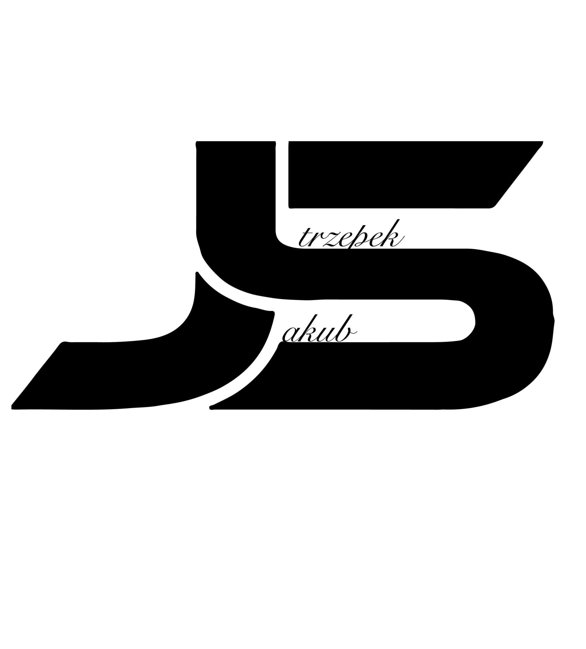
For the second logo I wanted to make something with a simple but effectively unique style therefore, I went on to use the pen tool in Illustrator and play around with it creating the letters ‘J’ and ‘S’ which are the initials of my full name however when you look closely you see that the ‘S’ looks like a five and the ‘J’ looks like one witch is ’15’ (2015) and that’s the year I came to England. But I still lacked depth to this logo so I decided to add the rest of my name inside the logo from the S and the J.