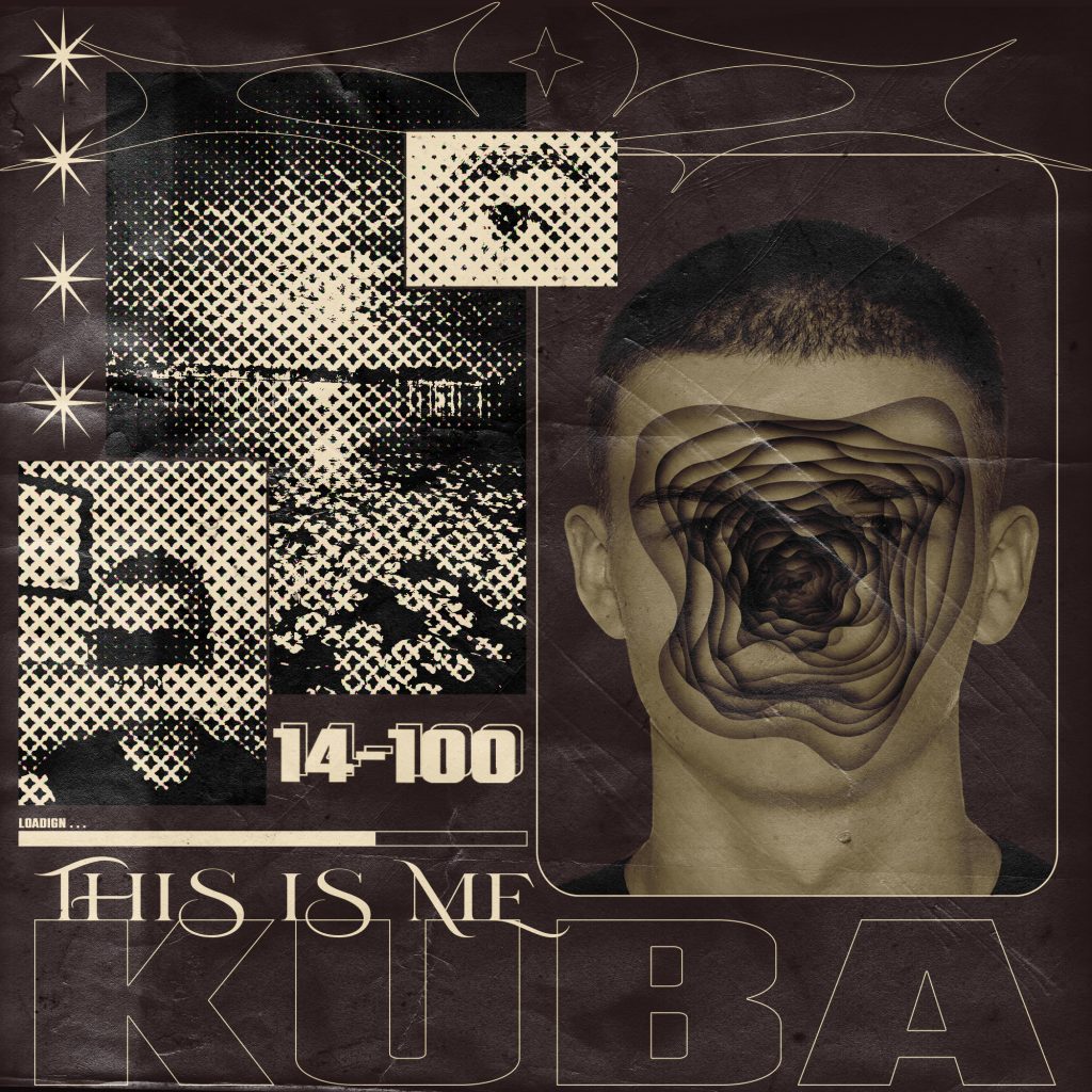
In the first poster, I intended to represent one of my favourite styles of graphic designing which is abstract brutalism. I started my first making another Adobe Photoshop portrait that I could use in the poster itself, the portrait once more represents the state of my head as it’s going inside my face creating one big hole in my face. Once that was done I then arranged the layout for the poster so the composition seemed interesting as I said before I find composition to be the most important aspect of any edit. The 3 images are images that I took that have something to do with me I added a pattern overlay over them to make them look more retro and broken up so they fit the whole visual aspect of the poster and like in most of my pieces I used ’14-100′ as this adds character to my work.
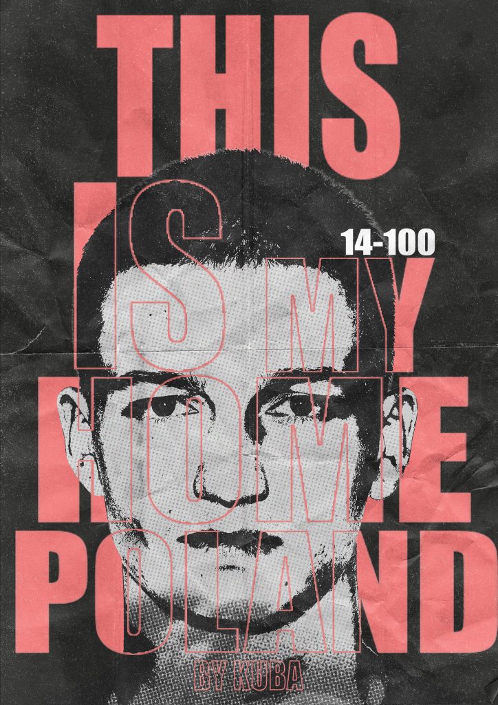
For my second poster, my idea was to create a retro-style poster inspired by a Polish film poster from the 90s with higher noise and high thresholds to give this old style to it. Not only that I tried to make the whole typeface significant I arranged and adjusted the spacing for each letter. In this poster I find these images to be very effective as you almost feel the star of the model on you and this adds even more depth and interest to it. The red I find to work very well as this subtle soft red makes the whole thing come together this type of read and bold type fonts were used in the 90s and this just highlights this idea of an old retro poster. Like in many other edits In this one, I also implemented the ’14-100′ just to show the importance of those numbers to me and to make this poster about me and what I stand for.
Figure Reference – Personal Photograph- Jakub Strzepek [Accessed 20 November]
Figure 2,3 Reference – Personal Photographs- Jakub Strzepek [Accessed 6 December]