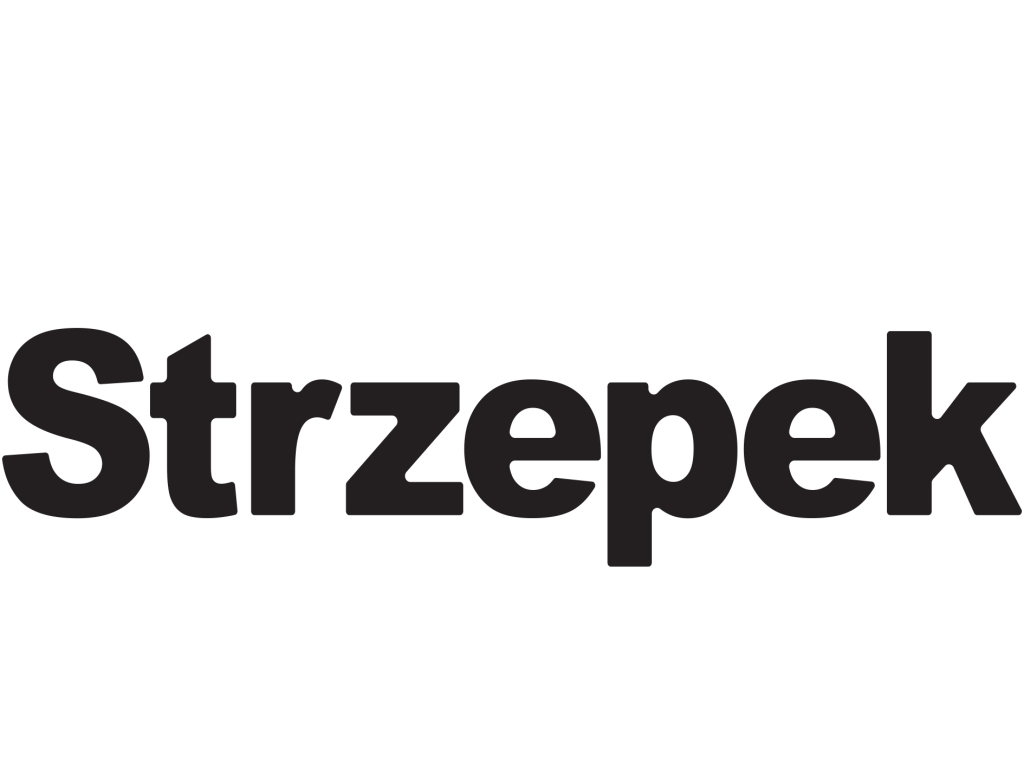
Both logos were made using Adobe Illustrator for the first name logo ‘Strzepek Kuba’ The ‘4’ represents part of my home town postcode ’14-100′ and I try to implement some form of that in most of my edits. My initial thought was to create something that would represent one of my interests therefore, I wanted to make this name logo look like a sports brand logo name as I am an active person with a large interest in sport. My thinking process was to make the logo black as that’s the main colour all large sports brands use but I want to keep a similar theme to all of my investigations and assignments therefore I believe this would nicely link to my theme of brutalism. I decided to round up all of the corners and arrange the spacing of the letters to fit my liking I thought this gave the logo an aerodynamic look as it almost moved to the right and I found that to work well and in my opinion nearly created a similar effect to the famous Nike swoosh as you follow what it says from left to right.
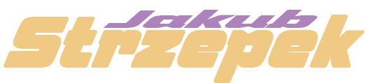
For the second name logo ‘Jakub Strzepek’ coming to this edit I had the same thoughts I wanted to keep the idea of the name logo to represent a sporting brand But this time instead of using a standard font I used something more exotic. The font I used is called ‘Speeday’ For this logo I put much more thought into the spacing and the arrangement of all of the latter when I found that to be working fine for my liking I then went on to stretch out the logo and tray to adjust it to almost look like an arrow that’s moving through the page to the right and this movement gives the logo action and an unconventional composition that gives this sense of formidability.