Colour is a very powerful tool when it comes to communicating emotions in designs as colours can be a synonym to many feelings and many emotions. For example, red is often associated with a worm colour as it’s the most visible on the spectrum, red can also be associated with for example danger. Brutalist designs use colour and texture schemes in almost every signal design as it is a tool that allows a graphic designer to feel the emotion the artist wants to show throughout his design. Brutalist designs often tend to use a monochromatic palette what that means is to predominantly use one colour throughout the whole edit, favouring black, white, and shades of Gray.
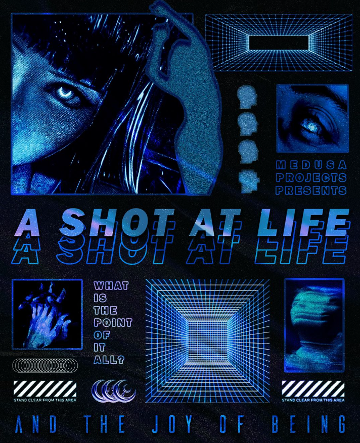
I just love this poster I find this to be complete this type of modern abstract brutalism poster is my favourite as I love every aspect of it the typography, the composition the layout and the colours used all the elements in the layout have their small story to tell and I find this idea to immerse the viewers even more and more into the poster creating this idea of the whole design to be drafted in advance to implement success. In addition to this, I find the dark blue colours and shades to implement this idea of stability creating a calm setting, I also managed to find out a bit more about the dark blue colour and what’s it associated with and apparently in Chinese culture dark blue is associated with longevity and immortality and I found this idea to work perfectly with the design as all the types, in my opinion, work well things like ‘a shot at life’ links with the longevity idea and that our lives can be long beautiful and calm, like I said I just find this poster to be almost perfect I love the story behind it the emotion it creates but also the technical of the design the layout composition, typography. This is something I want to carry forward into my upcoming investigations as I feel like I found something that engages me in this style of posters.
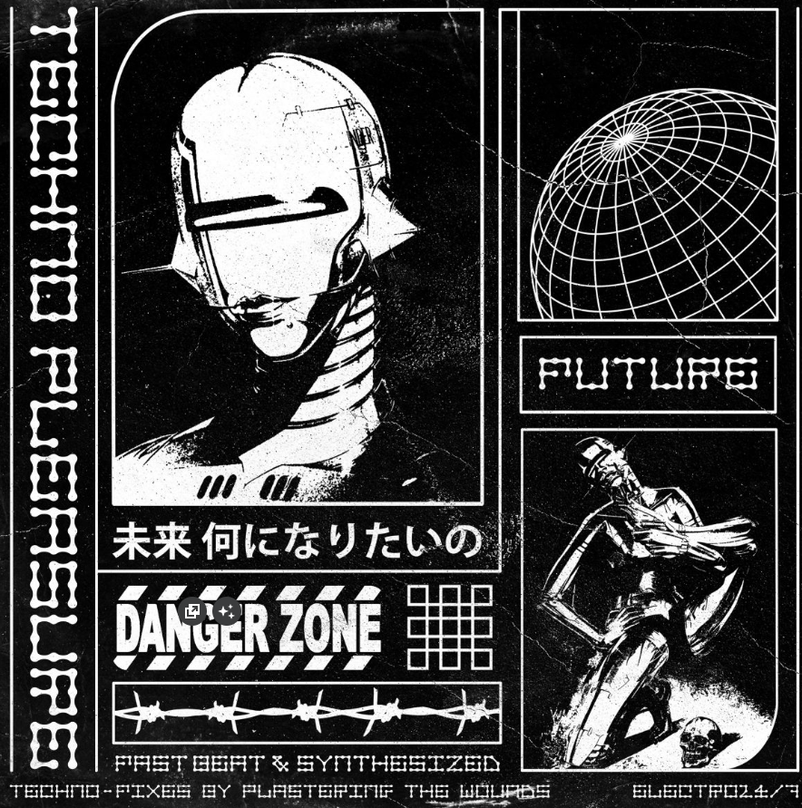
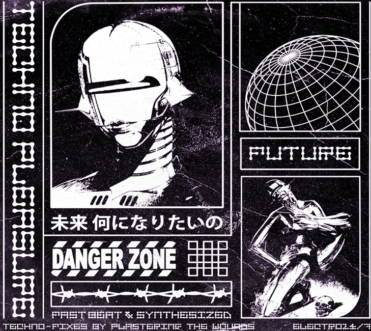
Similarly, like the previous poster I do find all of the elements very intriguing and interesting as I feel like I am fully engaged in the poster trying to work out each of the small elements in the layout and composition. However, when we take a closer look at the colour pallet it fits the brutalism idea of using one colour (monochromatic) for the edit I feel like a better colour combination could have possibly been used in this poster and yes the black and white contrast work very well in highlighting the most important aspects I fell like a brighter colour would add more vividity into the poster and some more flair into it.
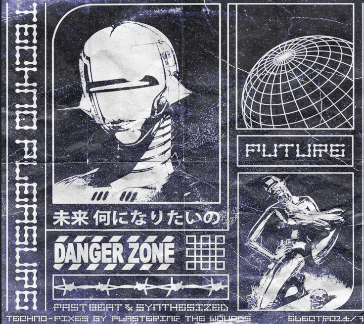
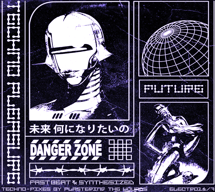
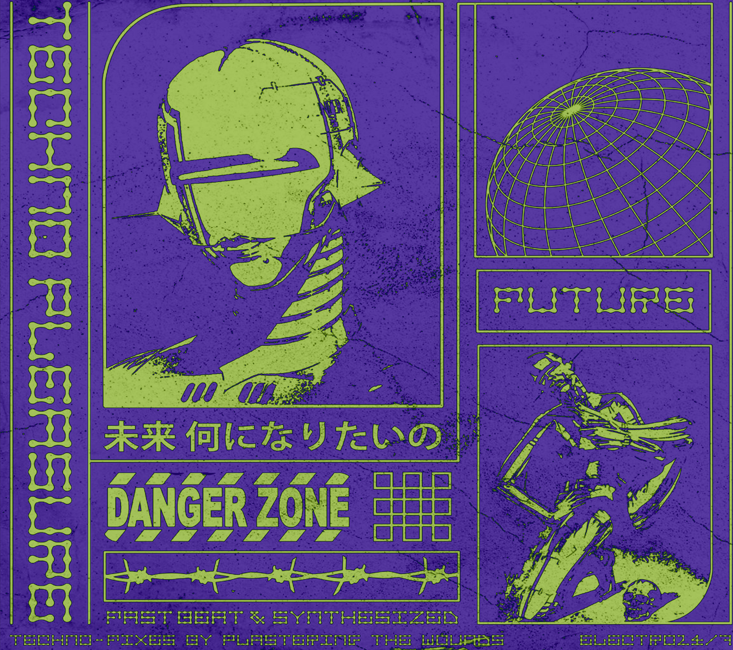
My first thought for this development was that the model/subject used in this poster I believe to be some sort of a knight so I decided to look for a colour that would represent the traits of a knight and in this case it was purple as purple is seen as a royal colour with dignity this idea comes from the fact that purple was very hard to make in the old days as the pigments for purple where almost unreachable and almost impossible to gather as exposer to sunlight turned it into white. I reached this effect by using a colour overlay with a blend mode of Divide. Not only that I also find this light purple to just work well with this poster emphasising all the small elements much more now making it much more eye-catching as it has a much more effective pop instead of using a plain black and white contrast.
Additional experimentation
Reference
Play Book Digital (2024) – Guide to brutalism in graphic design – https://www.playbook.com/blog/brutalism-in-graphic-design/#:~:text=Typography%20and%20font,challenging%20established%20notions%20of%20beauty.[Accessed 21 October 2024]
Pinterest (2024) – Abstract Brutalism Posters – https://uk.pinterest.com/pin/185069865932544526/[Accessed 21 October 2024]
Gold Rabbit (2024) – The importance of Colours – https://goldrabbit.co.uk/the-importance-of-colour-in-graphic-design/[Accessed 21 October 2024]
Wikipedia (2024) – Colour symbolism – https://en.wikipedia.org/wiki/Color_symbolism#:~:text=It%20is%20the%20color%20of%20the%20ocean%20and%20the%20sky,of%20grace”%20by%20divine%20favor.[Accessed 21 October 2024]
Figma (2024) – Colours (Dark Blue) – https://www.figma.com/colors/dark-blue/[Accessed 21 October 2024]
Pinterest (2024) – Abstract Brutalism Posters – https://uk.pinterest.com/pin/1055599902376105/[Accessed 21 October 2024]
Adobe (2024) – The colour Purple – https://www.adobe.com/express/colors/purple#:~:text=Purple%20has%20long%20meant%20rarity,its%20impacts%20have%20been%20lasting.[Accessed 21 October 2024]
MedievalTimes (2024) – Knights – https://www.medievaltimes.com/education/castles-and-battles/knights#:~:text=Knights%20were%20known%20for%20their,graciousness%20and%20courtesy%20toward%20women.[Accessed 21 October 2024]