Composition is the most important element of graphics, in my opinion, as it almost sets the story for the whole of the design guides the viewer where to look where the vocal point is where the main subject is and shows what happens in the poster that’s the way I feel about composition I put a lot of thought in my designs or at least try to implement this idea. I believe that attracts the eyes and makes the design stand out.
‘This is a reproduction of a New York Fly TWA poster issued by Trans World Airlines (TWA). It features an iconic design by the renowned American artist David Klein’ I find this poster to represent my views as I find this to be leading you towards the middle due to the movement of composition right into the poster this grabs your viewer’s whole attention making you full emerge and see what’s in store and what’s the poster has to offer. In addition, I love how the use of bright colours highlights the effectiveness of the composition as it emphasises the vocal point emerging into the poster, this is something I would like to try an implement in my upcoming work as this idea lays out the beauty of the design right in front off you. Not only that the fact that the buildings are constructed from squares and rectangles using geometrical shapes interlinks with the idea of brutalism of using hard geometrical shapes to gain a powerful outcome. I find this poster to be especially interesting as brutalism designs are usually composed of darker concrete-like colours to pay tribute to abstract brutalist architecture where the movement came from I would never have thought of using such vibrant colours in my future projects however I find this to magnificently highlight the composition where I will think about testing this idea in upcoming work.
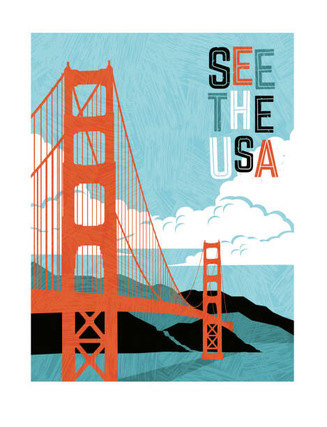
This Poster I find this to lack movement and although it seems the author has implemented a darker backdrop and a bright vocal point it does not have an impactful meaning and you don’t engulf the information that it’s trying to tell as there’s too much going on at the booth of the poster and you don’t tend to focus on the typography of the poster and that what matter in a poster as such that is promoting that the viewer visit USA. The composition seems to be all around the place you have one element on its own followed by another scattering the viewer all over the page with a focus on the bright orange contrast.
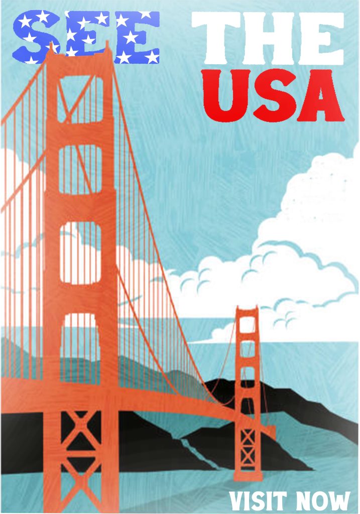
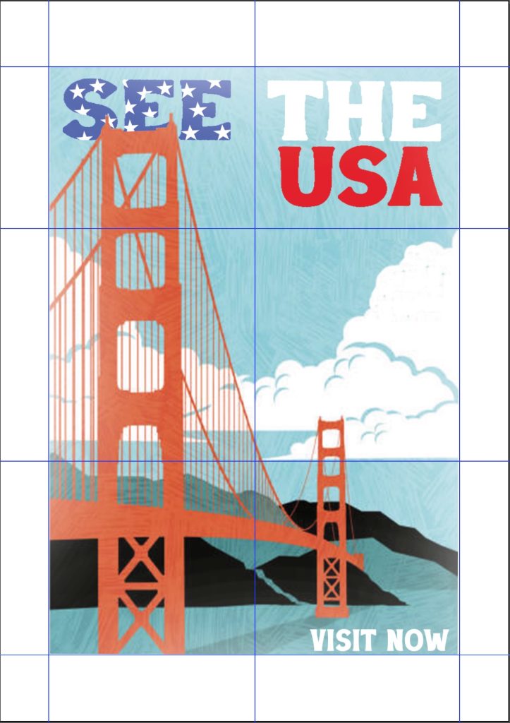
I went on to first set the possible composition for the poster I wanted to use a simple but effective rule of thirds to lay the elements of the poster to guide the viewer I first changed the typography of the poster to fill my thirds to have more going on in the top of the poster to even out the whole compositions the middle and bottom was more dominant than the top, adding on to that, I made the typography using brighter colours to make sure the type standout, throughout the whole of this investigation once more I went for a bold geometrically and symmetrically pleasing font to showcase at least some of the abstract brutalist ideas I went for an idea as such as I wanted to scale the type and use the idea of hierarchy of design where the largest things tend to be the main antagonist you look at first and this allows you the viewer to be guided around the poster find out out more witch each object on it.
Reference
Heritage Posters (2024) – New York Fly TWA poster – https://www.heritage-posters.co.uk/product/new-york-fly-twa-poster/ [Accessed 21 October 2024]
‘This is a reproduction of a New York Fly TWA poster issued by Trans World Airlines (TWA). It features an iconic design by the renowned American artist David Klein’
Figure 2 – Europosters (2024) – Wall Art Print – https://www.ukposters.co.uk/art-photo/retro-style-travel-poster-design-for-v138603 [Accessed 21 October 2024]
Canva (2024) – 10 Rules of composition all designers live by – https://www.canva.com/learn/visual-design-composition/# [Accessed 21 October2024]