The idea of implementing abstract brutalism architecture into graphic designing is a conceptual design itself adding two different things to create something with a deeper new meaning. Implementing Brutalism in design projects is to embrace raw materials, brutalism design emphasises the beauty of materials often showcasing them through undefined textures i.e. exposed concrete, raw wooden grains paper surfaces, to create depth and visual interest in the design.
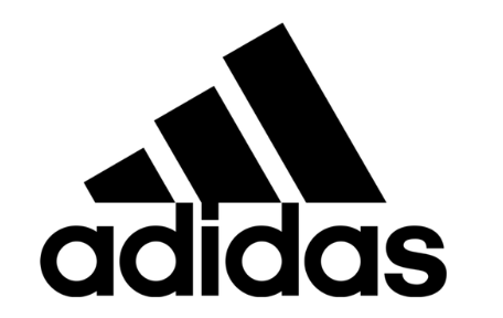
This is the most famous Adidas logo created to date, this exact logo showcases the true abstract brutalism ideas as it uses bold geometric shapes. On top of that, the typography itself almost set a foundation for the edit and in abstract brutalist architecture strong foundation is the first fundament that needs to occur for the whole design to be one strong holding and this logo is the perfect representation of this as the ‘Adidas’ type like I said create a base and fundaments for the three stripes which are a mountain they seam to be simple and this is what brings the true beauty out of a design, with a straight forward design showing the brands identity and I find this to be colossally impactful on the outcome. The neat composition makes the logo stand out not only that, but the dramatic contrast of black and white just emphasises the logo to pop right at you. In my opinion, a very successful conceptual design as Adidas is a sports/outdoors clothing brand and you associate the mountains with outdoor activities like hiking, running etc. I love how this very simple concept of using bold geometric shapes with a basic but interesting layout can bring so much interest and intrigue to a design and a logo as such. Over time becoming an iconic logo known by everyone.
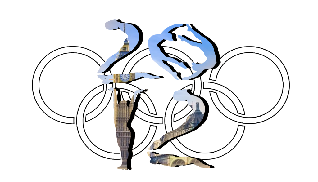
This is the logo that was used for the 2012 Olympic Games, in my opinion, a total disaster it’s very difficult to tell what it is and what it says not only that the bright vibrant colours do not help as although they are bright and abstract however they are to sharp and you tend to look away, and this is something as a designer I want to avoid. I understand how some may view this as interesting due to the uncertainty and mystery however, Wolff Olin from what I have read and what I understand from the research had to make something that shows that it’s the Olympic games it’s happening in London and 2012 and to be completely honest I can’t tell that this says 2012 I find the shapes to more look like ‘ZOK’ than 2012.
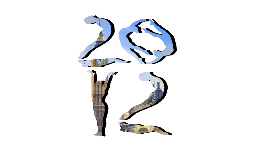
I decided to completely re-design the logo and create something new using the same three references that Wolff Olin used in 2012, London and the Olympics. To start I created silhouettes of gymnasts as this is one of the most famous sports in the Olympic Games I played around with the silhouettes to crate 2012 out of them as this is one of the guidance that Olin has received, for some extra depth I added a black shadow to make the ‘2012’ stand out more gathering the audience’s focus. My next thought was how to implement the idea of London into the design so I went on to mask the silhouette with a London skyline to emphasise the idea of the Olympics being in London, to finish of I added a back to the Olympic games logo just to emphasis that this is also the Olympic games we are talking about. Overall I do believe that the re-designed logo implements the idea of a conceptual design, I know that the logo I decided on goes in some way away from the abstract brutalist idea I tried to implement throughout the investigation I do believe it shows the three main idea from the 2012 Olympic games logo.
Reference
Loka Inc (2024) – Adidas Logo – https://looka.com/blog/adidas-logo/ [Accessed 20 October 2024]
99designs (2024) – What is conceptual design – https://99designs.com/blog/tips/conceptual-design/ [Accessed 20 October 2024]
Play Book Digital (2024) – Brutalism in graphic design – https://www.playbook.com/blog/brutalism-in-graphic-design/#:~:text=Typography%20and%20font,challenging%20established%20notions%20of%20beauty [Accessed 20 October 2024]
PickFu (2008-2024) – 14 Badly design logos – https://www.pickfu.com/blog/badly-designed-logos/ [Accessed 20 October 2024]
Olympic Games (2024) – London 2012 Summer Olympic Games – https://olympics.com/en/olympic-games/london-2012 [Accessed 20 October 2024]
Design Weak (2024) – Wolff Olin’s reflects on London 2012 logo – https://www.designweek.co.uk/issues/20-26-june-2022/london-2012-olympics-brand/ [Accessed 20 October 2024]