Abstract Brutalism
Brutalism is an architectural style with an emphasis on the material, texture and also the construction producing both bizarre but highly expressive forms. As brutalism designs demand attention the typography used in abstract brutalism designs is usually bold with geometric shapes and unconventional forms grabbing the viewer’s attention.
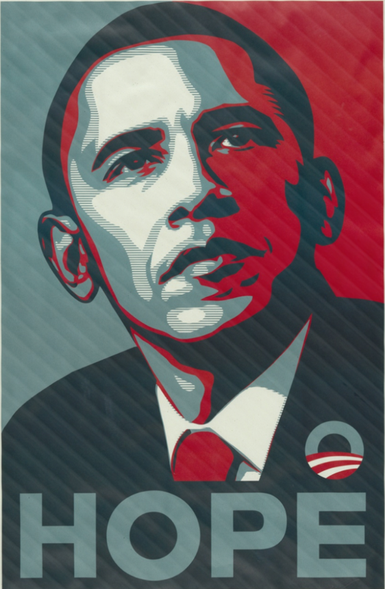
This is one of many posters used in Barack Obama’s presidential campaign in 2008 by American artist Shepard Fairey and his poster incorporates elements of brutalism. First of all the thing that stands out to me in this type is the spacing as you can see the spacing is perfect its symmetrically lined up with what seams to be a perfect point-to-point space in-between each later. Not only that I find the typography in this poster to be well-designed as it perfectly represents the idea of brutalist designs. The symmetrically bold stark font type crates this demand for attention and with the addition of texture on top of that this makes the typography the vocal point gathering the viewer’s attention right on to it and the fact that the word itself has a strong, courageous meaning creates this idea of a very powerful structural base for the rest of the elements in the poster, the portrait of Barack Obama vividly highlight the typography of this poster as the three colours used in the portrait prominently highlight the meaning of the word more due to the contrast it has created. Adding everything up, this type in this poster crates the emotion of a well-marked typography with a very strong eye-catching subtitle that speaks to the viewer making you the audience fully engaged in what’s happening inside it.
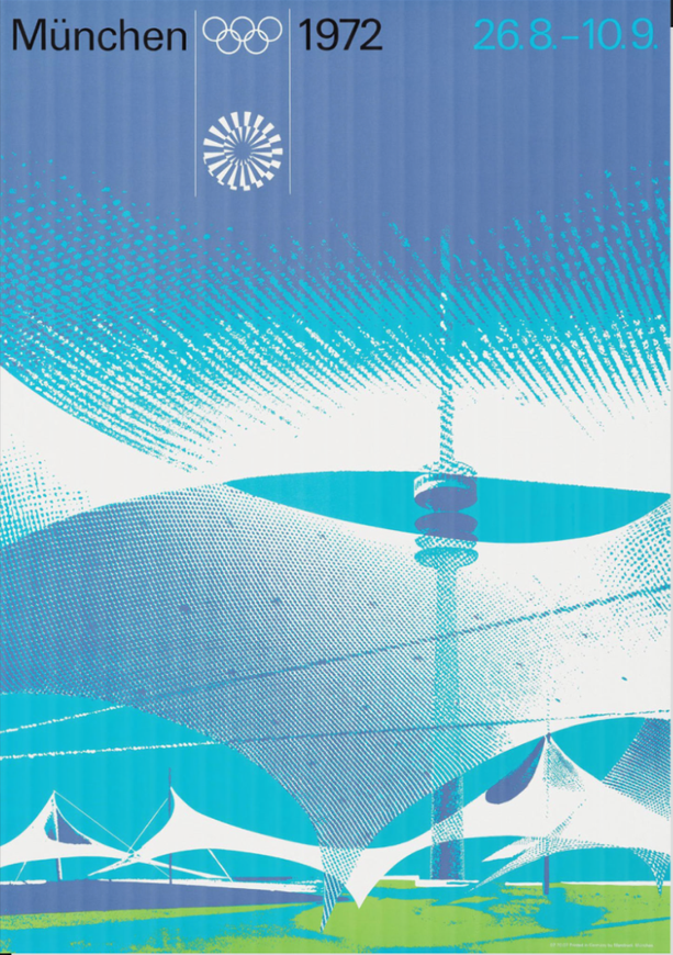
This is a poster created for the 1972 Olympic games, designed by Oti Aicher, this poster series challenged traditional design norms and remain some of the most recognisable Olympic visuals ever created. However, I believe that the typography on this poster is very poor as in my opinion it could be sharper and in most cases bigger I find this thin but also blank font to lack emphasis it’s the Olympic Games that are advertised in my opinion you need something that would represent this idea with a big eye-catching type that surprises the audience creating an impactfully and striking type that emphasises the idea of brutalism as the whole poster is inspired by gematrically pleasing shapes that combined together to create an out of the world outcome.
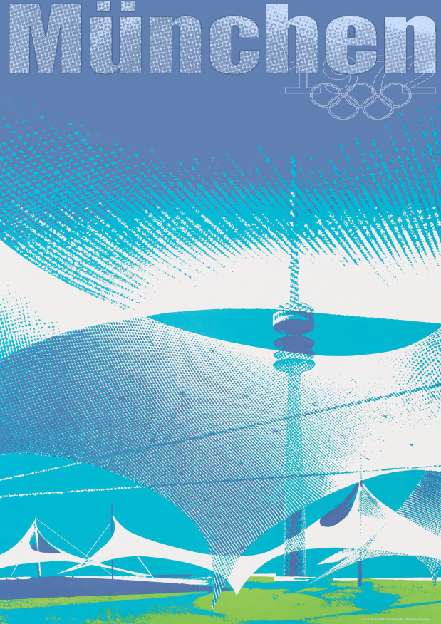

I have completely re-designed the whole typography of this poster I decided to go with a bold Arial black font to add some depth to the title but also to make it stand out as I felt that the small and thin typography on the original poster does not match the strong and powerful composition but also the concept of the design the poster contains a strong emphasis on large geometric shapes that create a massive building of the arena where the Olympic Games will take place and the small black font that was used does not really postpone the same idea as the rest of the poster and its muscular architecture, whereas now with a larger and a much braver title the poster looks more complete. On top of that, I decided to add some texture to the type so it blends well with the rest of the poster with a paper-like feel to it. However, I felt as if the texture was a bit too strong making the type stand out much more from the rest so I went on to add some white highlight on top of the type to slightly bring the vividity of the iceberg blue down in order for it to fit with the rest of the poster. To finalise the poster I went on to create an outline of 1972 and the Olympic Games logo to then place it behind the type to create a soft backdrop to the type.
Reference
RIBA Architecture (2024) – Brutalism – https://www.architecture.com/explore-architecture/brutalism#:~:text=Brutalism%20in%20architecture,construction%2C%20producing%20highly%20expressive%20forms. [Accessed 19 October 2024]
PlayBook Digital (2024) – Typography in Brutalism – https://www.playbook.com/blog/brutalism-in-graphic-design/#:~:text=Typography%20and%20font,challenging%20established%20notions%20of%20beauty. [Accessed 19 October 2024]
Material Design (2024) – Understanding Typography – https://m2.material.io/design/typography/understanding-typography.html#type-properties [Accessed 19 October 2024]
Wikipedia (2024) – Barack Obama Hope Poster – https://en.wikipedia.org/wiki/Barack_Obama_%22Hope%22_poster [Accessed 19 October 2024]
Olympics Games (2024) – 1972 Munich Olympic logo – https://www.playbook.com/blog/brutalism-in-graphic-design/#:~:text=Typography%20and%20font,challenging%20established%20notions%20of%20beauty. [Accessed 19 October 2024]