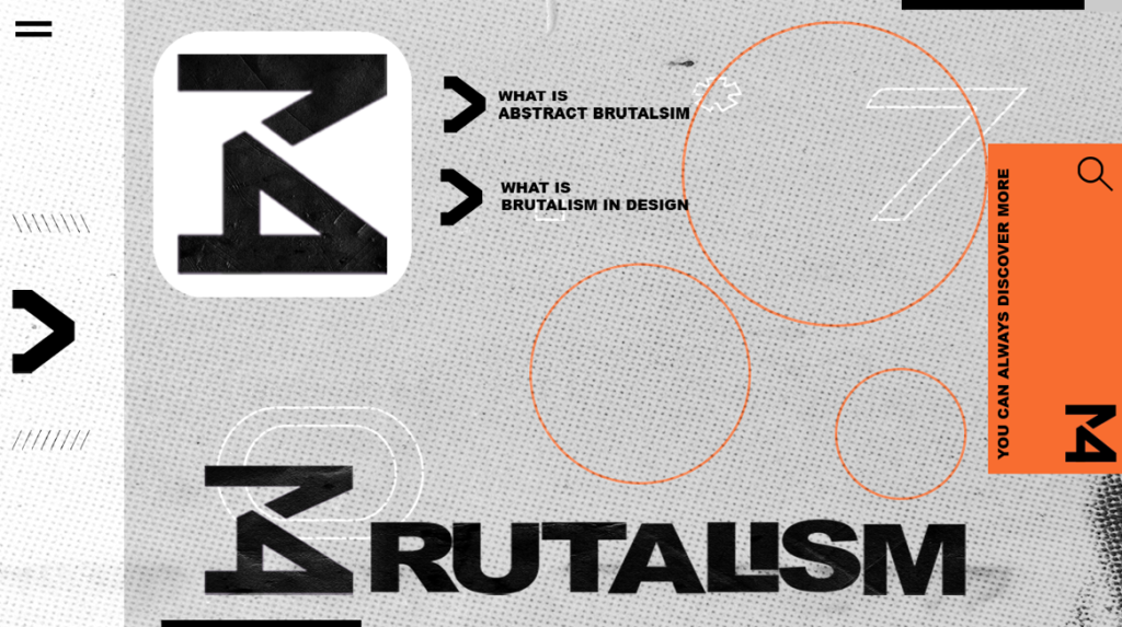
The first Web Page is the front page you would come across when you enter this website what I wanted for this page is that the audience could clearly see the logo and what the page is trying to show you, therefore, I went for a big logo that shows off the brand and headings of what’s coming and I think that this works perfectly as a front page as its simple and clear the technical and graphical side is like my whole project based around 4 of my colours from the brand standards as they represent brutalism to the fines I used all of the type fonts presented on the brand standards/guidance just showing how all of this links and works together.
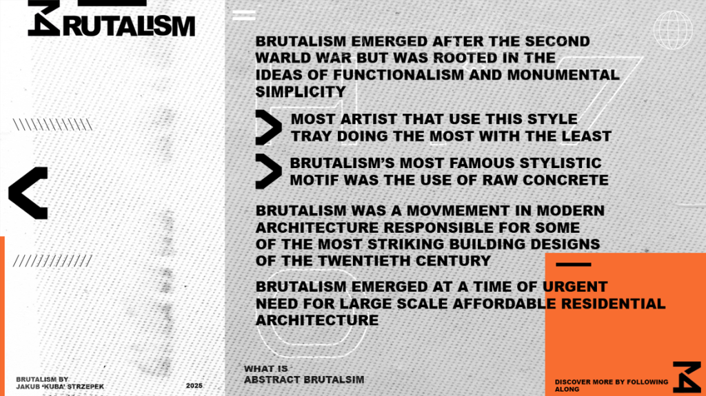
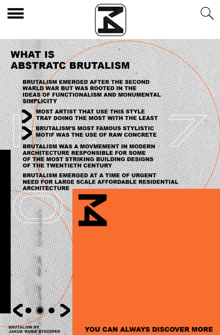
For the second page lets imaging you click on the arrow next to ‘What is Abstract Brutalism’ and that it takes you to a page where you have quick bullet points briefly telling you what Abstract Brutalism is my audience group is young adults I decided to add a quick and brief bullet points that will provide simple and fast information about Brutalism. I also focused on small elements to make the page stand I got another arrow on the left so when you ”pres” on it it takes you to the previous page I really tried to PUT emphasis on small details that will make the page seem realistic.
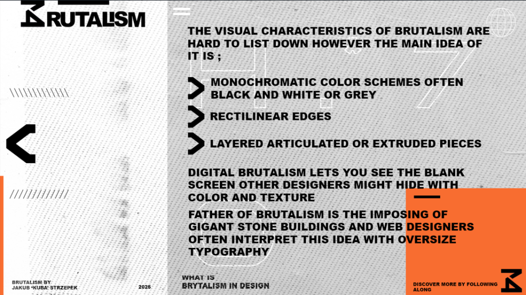
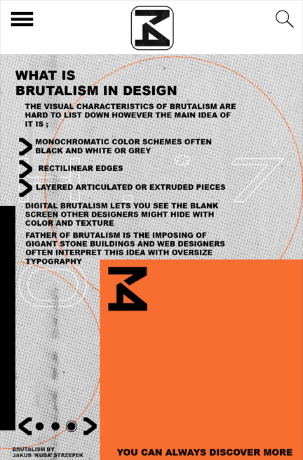
The final page is a replicated layout with a different set of information in the real world you don’t get websites where one section is completely different to another therefore I kept it the same to really make you as the audience fell like you on the real thing. Once more here I went for small and short bullet points as the information to quickly get the point across as my audience group is aged around 18-25 years old that surf the internet.
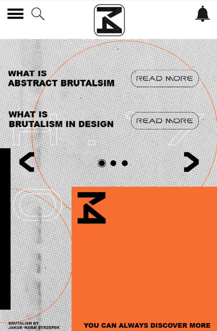
In addition to all of this, I designed 3 more mobile pages to show how this website would look on a mobile device as it is a phone page I wanted to make it even simpler as usually, phone users that go around the internet don’t spend hours on it therefor I went on making a sherchbar with a smaller logo and fewer elements witch even more clear instruction to quickly navigate around a mobile device. Like on the web pages, the information on the next two pages is the same small bullet points to quickly give insight into what’s brutalism is and how it impacts the graphics in the modern world. All of the edits that are in this series contain a unique pattern created using Photoshop to make it look a bit more rough and concise like the colours, fonts logo nothing has changed they are just adjusted to match a phone user.
Reference
RIBA Architecture (2024) – Brutalism – https://www.architecture.com/explore-architecture/brutalism#:~:text=Brutalism%20in%20architecture,construction%2C%20producing%20highly%20expressive%20forms. [Accessed 19 December 2024]
PlayBook Digital (2024) – Typography in Brutalism – https://www.playbook.com/blog/brutalism-in-graphic-design/#:~:text=Typography%20and%20font,challenging%20established%20notions%20of%20beauty. [Accessed 19 December 2024]
99Designs (2024) – Brutalism in design: its history and evolution in modern websites – https://99designs.com/blog/design-history-movements/brutalism/ [Accessed 19 December 2024]
The Art Story (2024) – Brutalist Architecture – https://www.theartstory.org/movement/brutalism/ [Accessed 19 December 2024]