Like in almost all of my edits and previous projects, I tend to use the numbers ’14-100′ as this is the postal code of where I am from and like I said many times now I take a lot of care and dignity in representing my home town I even took this to an extend where I got a tattoo of ’14-100′ and now over time I almost feel like the fact I try to use ’14’ or the ‘100’ somewhere In my work become a ‘watermark’ of mine and a creative way to show that the work is mine as its showing that I own the work and make it stand out and during class, I have received similar feedback when it comes to this idea as overlay people found this to be a very interesting and creative signature in my developments.
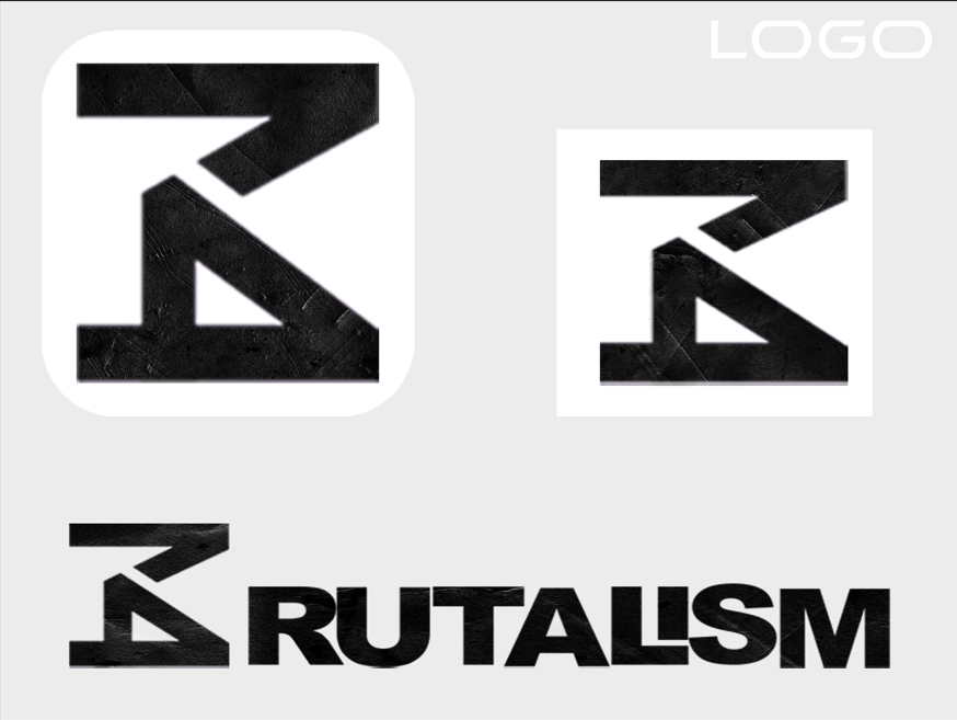
However, the making process of this logo itself was very interesting as I got the numbers ‘1’ and ‘4’ and just played with them for hours in Adobe Illustrator making one smaller one bigger changing the arrangments literally matching and seeing how it works with one another but at the back of my head I did not want to lose the brutalist style and them so I expanded the ‘1’ and ‘4’ and made them much bolder to emphasises the idea of brutalism and then it hit me and I came up with the idea of turning those two number into a ‘B’ so that it’s going to be the first letter of the word brutalism when I had managed to arrange the numbers in a way it creates the ‘B’ I realised that by extending the end of the one I could also make it look like a ‘K’ at the same time so I left the corner shard so it also looks like a ‘K’ which is the first letter of my name.
I had created the ‘B’ and I was happy with it however I thought to myself that a B on itself could be anything so I decided to carry on and make a second version of the logo with the whole type ‘B’ rutalism using Arial Black font I changed the spacing and played around with the arrangement to make it a bit more slicer and bolder to keep the theme of brutalism going. But I was still missing something therefore, I made the ‘L’ and ‘I’ as one thing to make it look like a building almost like a tower to emphasise the idea of brutalist architecture and that is massive blocks of concrete that create buildings. However, that was still not enough for me so listening to the feedback I got in class I added my own pattern in Photoshop over the type to make it stand out and fully look like concrete by adding a rough and worn-out concrete-like pattern.
Reference
RIBA Architecture (2024) – Brutalism – https://www.architecture.com/explore-architecture/brutalism#:~:text=Brutalism%20in%20architecture,construction%2C%20producing%20highly%20expressive%20forms. [Accessed 19 December 2024]
PlayBook Digital (2024) – Typography in Brutalism – https://www.playbook.com/blog/brutalism-in-graphic-design/#:~:text=Typography%20and%20font,challenging%20established%20notions%20of%20beauty. [Accessed 19 December 2024]
99Designs (2024) – Brutalism in design: its history and evolution in modern websites – https://99designs.com/blog/design-history-movements/brutalism/ [Accessed 19 December 2024]
The Art Story (2024) – Brutalist Architecture – https://www.theartstory.org/movement/brutalism/ [Accessed 19 December 2024]