This blog will build upon the preceding post to enhance the User Experience (UX) and User Interface (UI) of the Clout Festival website. Enhancements will be achieved through conducting primary user research and making adjustments informed by user feedback, in addition to incorporating several design concepts and layout options discussed in blog posts 3, 4, and 5.
Website design artwork development (developed from research)
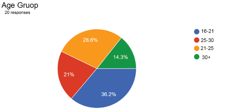
This suggests that improving the website to better serve an older audience may not be as disadvantageous as it appears, given that this demographic constitutes a substantial segment of users. Consequently optimising the website for older individuals could enhance the overall user experience leading to greater user satisfaction and potentially increasing sales thereby benefiting stakeholders.
This could be things like:
- Decreasing the number of option/ques
- Use less colours stick to 4 or 3 tones
Competitions Homepages
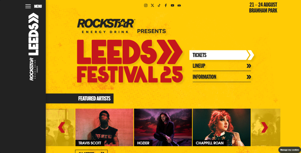
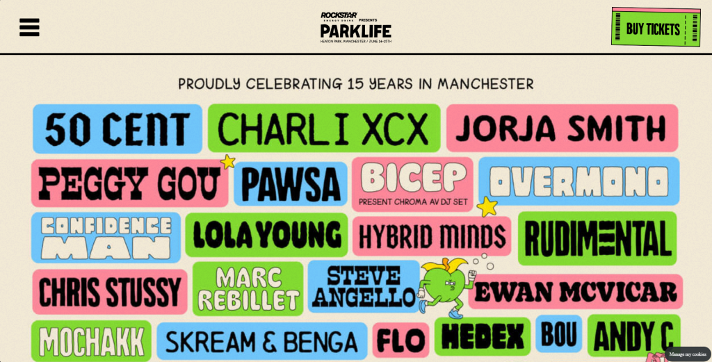
Which of the two above you find more effective ?
What Information are you looking for on a festival website ?
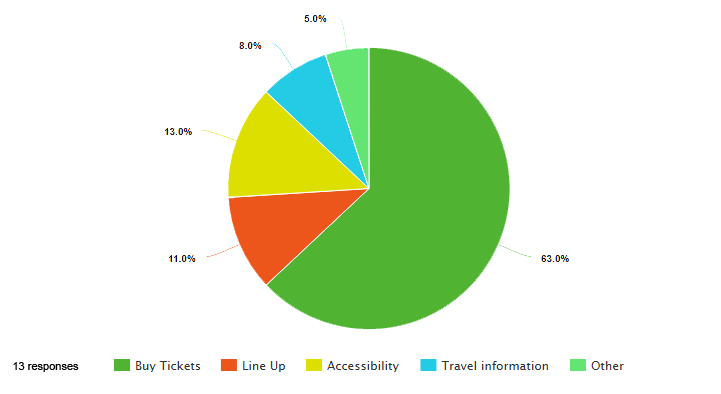
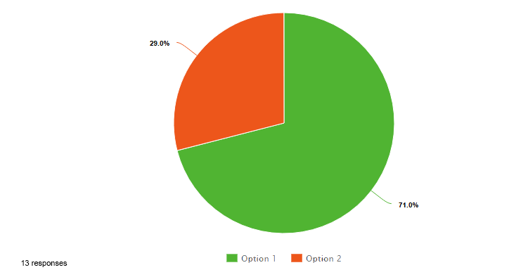
I aimed to analyse various festival websites to determine the factors contributing to their success. Additionally, I developed a brief survey consisting of two questions to evaluate two different competitors. From this survey I concluded that the ticket purchasing feature is the most crucial aspect. While I am focused on addressing a specific problem space I must ensure that I do not overlook this key feature in the process of finding a solution in progressing from the prior research assignment, I have taken into account the user research and the user journey map to ensure that the problem space continues to be addressed. Furthermore, as the user experience design process advances, the clarity of the problem space improves, making it increasingly manageable to tackle through design. The website’s landing page features the logo prominently displayed in bold lettering, serving as the central focus of the page.
Mid Fidelity Prototype Mock Up
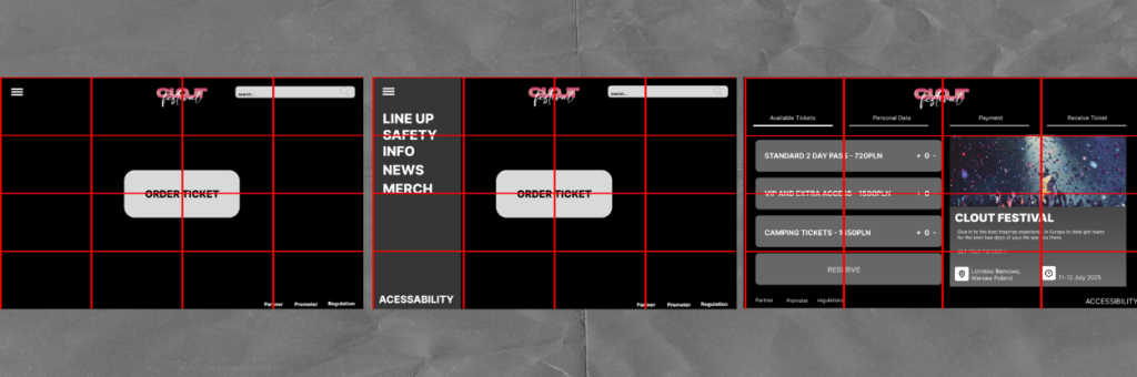
In terms of composition, my objective was to divide the entire website into rectangles of four, ensuring a clean and symmetrical aesthetic. For instance, on the final page, each set of four rectangles corresponds to specific sections, collectively contributing to a well-distributed layout. This design allows for glimpses of the background in each segment while also incorporating elements and features that are actively interactive.
As I previously mentioned the area of concern was the accessibility section and the inclusion of additional information as some users may require it. However, I was apprehensive about losing sight of the website’s primary objectives, particularly since users primarily visit the site to purchase tickets, which is the key feature we can argue is the most significant. Therefore, I ensured that the call-to-action button remains prominently positioned in the centre with a strong contrast against the background (colour details will be discussed in a later post) to capture the user’s full attention. If users wish to access more information they can click on the three horizontal lines in the top left corner which will reveal a small submenu that allows for further exploration with more detailed information regarding CLOUT Festival.
In light of this I will conduct further research to finalise the precise visual elements including balance, contrast, alignment, repetition, and hierarchy. This is essential to ensure an optimal user experience as the information will establish a solid foundation allowing us to concentrate fully on enhancing our users experience.
Reference
Leeds Festival – Home Page (2025) https://www.leedsfestival.com[Accessed 5/4/25]
Park Life Festival – Home Page (2025) https://parklife.uk.com[Accessed 5/4/25]
Mailchimp – How to Build a Great Website (2025) https://mailchimp.com/resources/how-to-make-a-website/[Accessed 5/4/25]
Surveymonkey – Best practices for writing good survey and poll questions(2025)https://uk.surveymonkey.com/mp/writing-survey-questions/[Accessed 5/4/25]
Imperial – Writing Surveys (2025) https://www.imperial.ac.uk/staff/tools-and-reference/web-guide/training-and-events/materials/top-tips/writing-surveys/[Accessed 5/4/25]
Pie Charts
Pie charts created using – Meta-chart https://www.meta-chart.com › pie[Accessed 5/4/25]
Second form of Pie charts – Google Forms https://workspace.google.com/intl/en_uk/products/forms/[Accessed 5/4/25]