This post will be exploring the functionality of the User Interface (UI) of the ‘Rebirth of the mage’ app created using Figma.
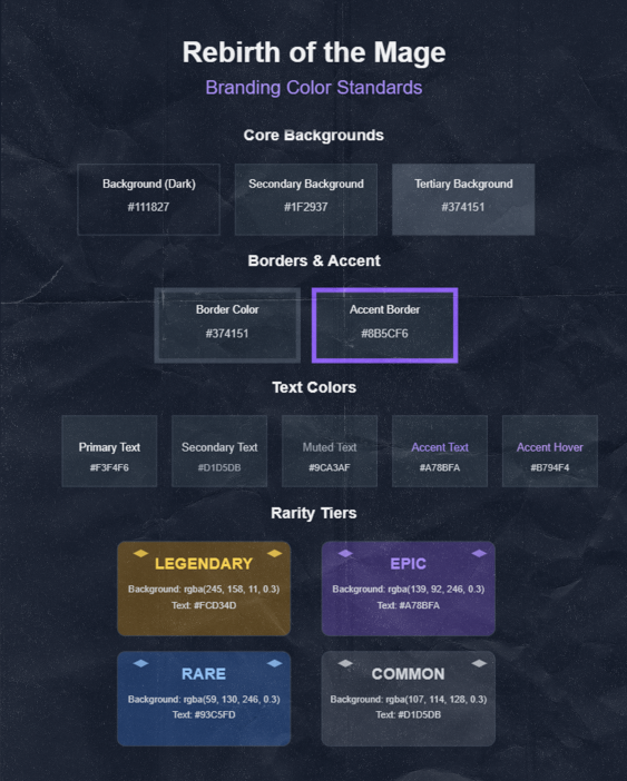
To start the high fidelity prototype I duplicated the wireframe pages created in the previous post. I then used the brand standard I have created using Photoshop and Illustrator (Post 1) to ensure the same colours and typography throughput the whole design.
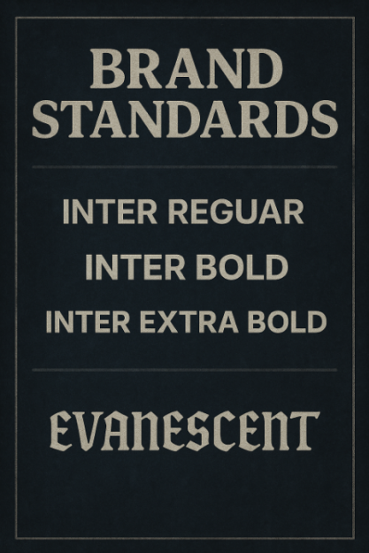
The typefaces featuring in the prototype are Inter Regular for body text with its clean neutral appearance and excellent readability Inter Bold for emphasis and section headings providing stronger visual weight while maintaining the typeface’s modern aesthetic and Inter Extra Bold for maximum impact in titles and key elements.
Both Million Design and evanescent font types where not used in the prototype I used them in the poster and the logo for the project as evanescent font adds this mysterious feel to the aesthetic whiles million design add unique character reflecting to the fact that this game is about magic and unique thinks.
I went with a deep blue gray that works well as a primary background for dark mode interfaces. It’s dark enough to reduce eye strain while maintaining enough colour to avoid looking purely black i also used A slightly lighter blue gray that creates subtle contrast against the primary background. It’s commonly used for cards panels or secondary UI elements. I also used on certain elements An even lighter blue gray that provides additional layering and depth. I also went for A vibrant purple that adds a pop of colour to the otherwise monochromatic palette. This accent colour draws attention to important elements and adds visual interest.
Wireframe (click here)
Prototype (click here)