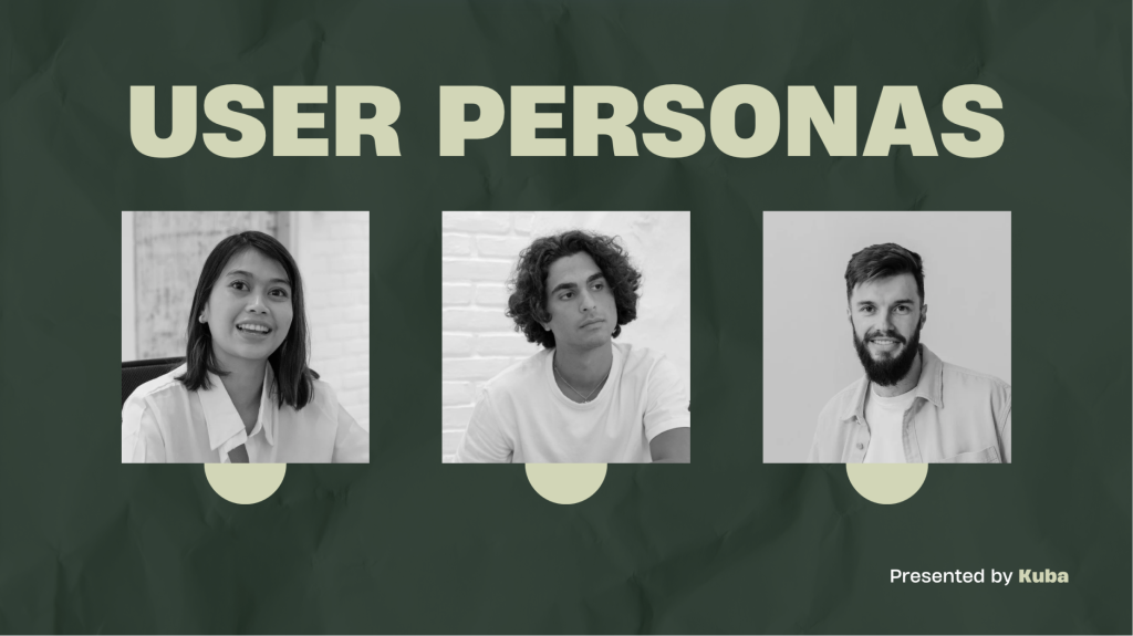
Telling the Story of The Participatory Collective
Intro to Participatory Collective
Participatory Collective (PC) is a network of community groups, individuals, and organisations in Hull and East Yorkshire. It was created to bring people together to shift power, change systems, and support communities to flourish in a welcoming, equitable space. PC started with Ideas Fund projects but now welcomes anyone who wants to work in a relational participatory, ethical, and human-centred way. This means putting people’s knowledge and experience at the heart of decisions – not just doing things for communities, but with them.
The Participatory Collective is an expanding initiative in Hull and East Yorkshire that unites community organisation researchers and leaders with lived experiences to collaboratively generate knowledge and social innovation and enhance mental health and well-being.
In the principles of participation and co production the Collective emphasises the importance of collaboration lived experiences, creativity and the equitable distribution of power between communities and researchers.
Each initiative within the Collective exemplifies a distinct partnership where research is conducted in collaboration with communities rather than on them. These partnerships address urgent local challenges ranging from addiction recovery and dementia care to youth well-being, justice reform, and community revitalisation employing creative, inclusive, and action oriented approaches.
The mission of the Collective is to revolutionise the design and delivery of research and support services ensuring they accurately represent the realities voices and aspirations of those most impacted by the issues at hand. In this endeavour a network characterised by trust, empathy, and shared learning which fortifies communities and contributes to the establishment of more equitable systems of care and well-being.
Audience & Stakeholders
Numerous initiatives undertaken by these organisations involve partnerships with local community groups. These entities function across a range of sectors, such as health, inclusion, disability, mental well-being, the arts, and social justice.
Projects often centre on individuals with lived experiences or those belonging to vulnerable or marginalised communities, aiming to support those confronting challenges like dementia, learning disabilities, mental health disorders, addiction and recovery, as well as brain injuries.
As a result, individuals who are directly affected by or resonate with these issues form a key demographic. Researchers and academics, along with knowledge partners, frequently collaborate on various projects, co-designing or implementing them in conjunction with scholars from universities and academic institutions to derive insights, evaluate impacts, or jointly develop knowledge. Consequently, donors, philanthropic organizations, foundations, and public funding entities emerge as crucial stakeholders, especially in terms of justifying impact and related factors. Policymakers, public agencies, and health and social care systems are also significant, given that many initiatives relate to health, inclusion, well-being, and mental health, with outputs aimed at influencing policies, services, or public systems.
Local, national, and global outreach is essential for both government funding for future initiatives and potential collaborations. Additionally, it serves the everyday users who wish to explore and learn more about various challenges and may consider supporting the foundation.
Competition
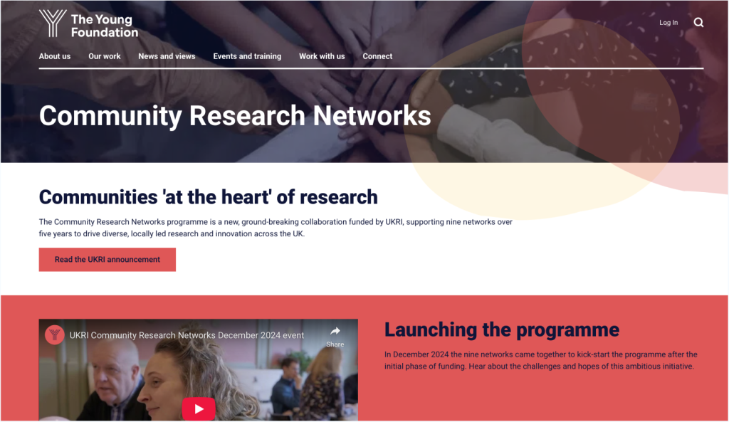
Among the four websites evaluated, The Young Foundation distinguishes itself with its impressive visual design, distinct branding, captivating content, and effective calls-to-action, rendering it the most refined in terms of graphic design and digital marketing.
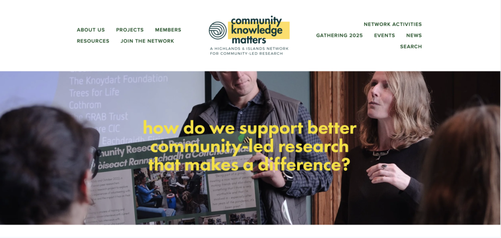
Community Knowledge Matters possesses a solid foundation and a tidy layout; however, it could enhance its appeal with more visual impact and more compelling CTAs.
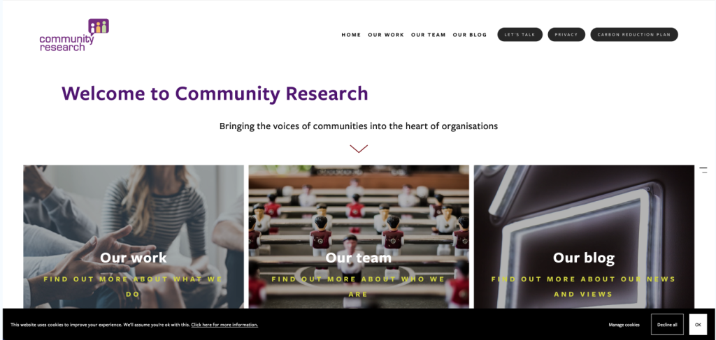
Community Research appears professional yet visually unremarkable, lacking in personality and engagement features.
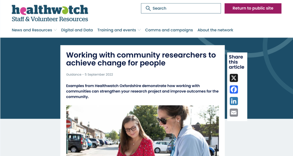
The Health watch guidance page is both informative and well-organised, yet it is excessively text-heavy, offering minimal visual attraction. In summary, all websites have the potential for improvement by incorporating stronger visuals, clearer calls-to-action, enhanced storytelling through imagery or multimedia, and more dynamic methods to engage visitors.
Web Design Trends – Mood board
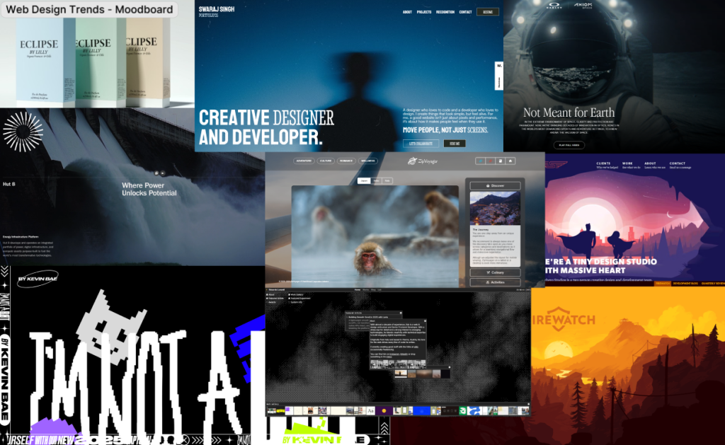
After that, I chose to look online for various website design trends that are currently popular, hoping to discover some inspiration for the prototypes. The key aspect I concentrated on while browsing different websites was to find something featuring a parallax effect. A parallax effect creates a scrolling illusion where the background images shift at a slower pace than the foreground elements, which gives a sense of three-dimensionality in a two-dimensional space.
I then set out to investigate all the non-profit organisations that partner with Ideas Fund because my task is to create a collective website for these groups. Three organisations really caught my attention since they were the only ones with established websites and some but very limited social media presence, while nearly all the other organisations were missing both of these important features.
The OSHI Project is a groundbreaking initiative that offers immediate assistance to those in need. It is led by peers and fuelled by personal experiences. It builds connections between individuals seeking help and those who can provide it. Additionally, OSHI serves as a holistic recovery community, offering everyone the chance to enjoy life and start healing body, mind, and soul through an ongoing program focused on recovery and personal growth.
From a designer’s viewpoint, OSHI is the first and, in my opinion, the only organisation with a fully functional website that has a clear yet minimalistic structure, complete with a compelling story. It starts with an introduction, then delves into the services they offer, and finally provides information on how to contact them. This layout creates a logical flow, unlike many other organisation websites. Aesthetically, OSHI strikes the best balance among all the organisations, featuring a strong colour palette that remains consistent throughout the site, a logo that clearly reflects the organisation’s mission, and a soft, inclusive typeface that appeals to the audience. However, when it comes to social media, there is virtually no presence aside from a YouTube video about the organisation, which greatly limits the footfall of new users, reduces brand awareness, and misses out on significant exposure to younger audiences.
The Butterflies Memory Loss Support Group was founded by June Cooke in 2010 after her father, George, received a dementia diagnosis in 2008. She realised that while there were services and support for those diagnosed with the illness, there was very little available for their families and close friends, along with limited access to groups that included both.
From a designer’s perspective, the first thing that stands out to me is that the website lacks quality. Almost all the images used are outdated or of poor quality, which is not good because it gives the website an unprofessional feel, making users sceptical right from the start. As you dig deeper, you begin to notice how many issues there are. While I understand that websites should provide more information, I find this particular site to be overloaded with it. It’s hard to navigate clearly because of a confusing story. Additionally, the call-to-action buttons don’t help, as they are unclear due to minimal or almost no contrast with the rest of the site. Because of the excessive amount of images and information, navigation is very limited, which decreases user satisfaction reducing brand awareness. Similarly to oshi, butterflies are not present on social media because they are either outdated or inactive. As I mentioned before, this greatly restricts brand awareness, which decreases user engagement. It also hinders the ability to attract new volunteers, as it misses out on an entire demographic that actively uses social media which in this age is stupendous.
The NORM well-being project, created by Youth Aspire Connect, is focused on developing toolkits and creative resources. These resources are designed to help young people, parents, and community leaders tackle the stigma surrounding mental health. The goal is to make conversations about mental health and well-being more frequent among youth from underrepresented backgrounds. The researchers will help the community identify the obstacles to discussing mental health and well-being, and they will collaborate to create the toolkits.
I chose to examine this organisation more closely because it was the first one to achieve some level of success in the social media field, especially by having a presence on various platforms, mainly YouTube. I found this intriguing since Youth Aspire Connect targets a younger audience, and I began to question whether this is due to the fact almost all of the other organisation from participatory collective are focusing on an older demographic that might not engage with social media. This is definitely something I need to investigate further while developing the social campaign, as I must ensure effective interaction with all the participating collective organisations.
In my opinion, the website itself lacks depth and thought. The layouts are uneven, and some pictures are cropped, which doesn’t look good. This drives both the audience and users away since it’s not visually appealing, giving it an unprofessional feel that makes it hard to take seriously. Simple things like the call to action aren’t very clear either; the contrast between the website and the call to action button is weak, making users sceptical about its actual function. However, I have to admit that the storytelling aspect isn’t bad. It includes all the key features of a successful story, starting with an interesting introduction that clearly states what it’s about, a decent midpoint where you can learn more, and it ends on a climax by engaging with the users.
Ethical approaches to web design + UX/UI
- User centred design, often referred to as UCD emphasises the importance of designing with the genuine needs, preferences, and limitations of users in mind. Ethically, this approach honours the autonomy and well-being of users. A prime illustration of this methodology is the practice of testing prototypes with actual users and considering their needs and desires.
- Privacy first design refers to the approach of creating systems that reduce data collection and honour user consent, while also elevating privacy to a fundamental design principle. A prime illustration of this concept is the implementation of transparent cookie consent mechanisms, which avoid unnecessary tracking of users.
- Inclusive and accessible design refers to creating designs that cater to individuals of all abilities, races, genders, languages, and economic backgrounds. Web Content Accessibility Guidelines (WCAG). A prime example of this is ensuring that screen readers can accurately interpret content, as well as making certain that colour contrast is sufficiently readable.
- Sustainable web design emphasises minimising the environmental impact of websites (for instance, decreasing energy consumption) while also considering ethical obligations to the planet and future generations. A prime example of this is the optimisation of images and code to lessen server load and carbon emissions.
Low Fidelity/layout experimentation
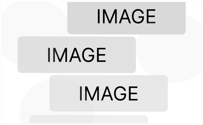
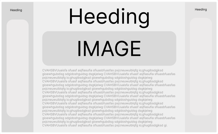
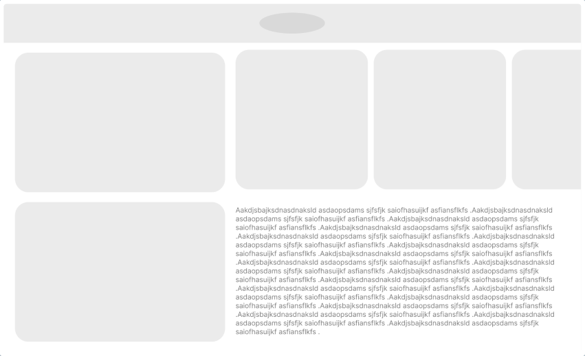
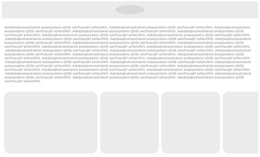
As I briefly mentioned, I want my website to feature a parallax design where the background and foreground move at different speeds while scrolling. This approach can make the website more immersive, dynamic, and significantly engaging. Additionally, it’s a really interesting and successful way to tell a story through design. Therefore, I would like to create a parallax effect. I’ve started to incorporate this idea in the images above (low-fidelity prototypes/layout), where the first page consists of a series of images that flow down almost like a staircase as you scroll. I was thinking of making each image represent the actual organisation, so then when you click on it, you enter the standard website layout, which includes a heading, some text/information, and images to support the page, as shown in the next three images that follow from the first.
Logo Sketches
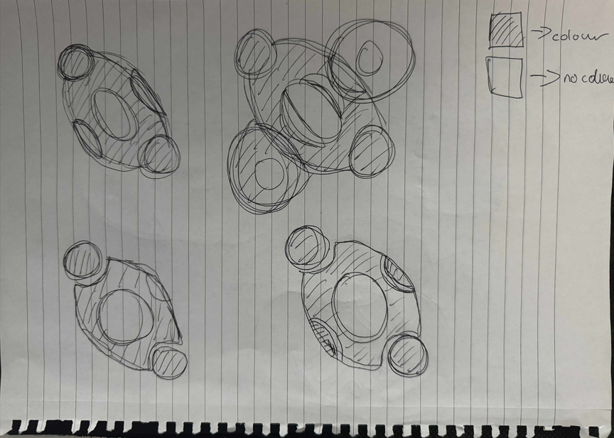
This was my first attempt at creating the logo. My main goal with this logo was to convey the idea of different people working together as a community, while still keeping it minimalistic and simple. Therefore, I started to experiment with various shapes to represent people. I managed to create a logo mark that shows two people holding hands. Once I was satisfied with it, I began to play around with the sizes and made small adjustments to enhance the human-like appearance of the shapes.
However, one of the lectures stood out to me; it was about trying to weave and wrap ideas together. Therefore, I recreated the sketches, and I was able to create something that I find powerful and meaningful while being simple. This was the turning point in creating the logo as I was able to show different people working together, and that’s what Participatory Collective is all about.
Typography Choices, and Early Colour Schemes
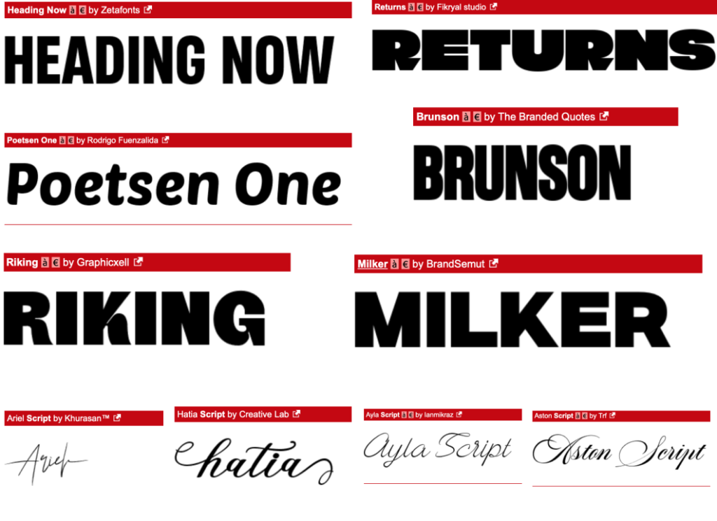
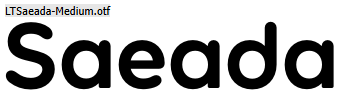
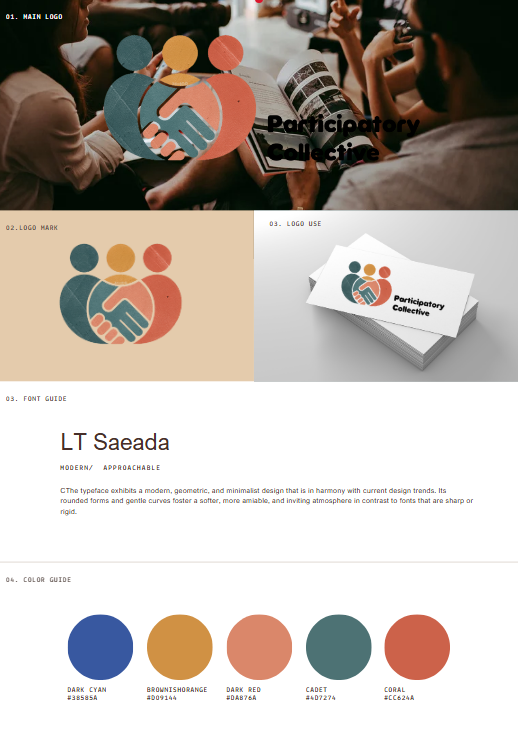
The main focus going forward when I started making visual choices was to ensure that the mission of the participatory collective wasn’t lost. So, I began collecting typefaces that I thought were both approachable and soft, yet also modern, trying to create a gentle foundation for the possible designs that would come from it. The final typeface I chose is LT Saeada, which is a geometric sans-serif font that is modern, rounded, and friendly, designed to combine contemporary style with a sense of warmth. Created by LyonsType, it has clean, minimalistic letterforms with soft curves. The name “Saeada” translates to “happiness” in Arabic, and its design uniquely combines rounded tops with square bottoms.
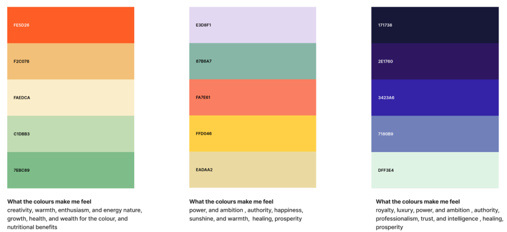
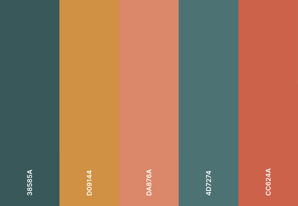
For the final colour palette, I chose to tone down the colours to soften and nearly neutralise emotions. However, I still wanted to include some shades of red because I strongly associate the colour red with a mix of positive and negative feelings and ideas, such as passion, love, and excitement, along with danger and warning. It is also linked to power, strength, and energy, and historically to sacrifice and courage. I believe this concept aligns well with the participatory collective, as many individuals sacrifice themselves to help others become more inclusive and open to everyone.
I also opted for some muted shades of blue because I wanted to soften the emotions a bit. I find the logo to be strong on its own, so I aimed to create a contrast that would leave a bigger impact on the audience. Additionally, I associate blue with stability and professionalism. Darker, muted blues like navy, which blend blue with black, convey authority, dependability, and trustworthiness. This is something I want to achieve to build trust between the participatory collective and the users/audience, so they feel more connected to the company and truly feel like they are part of the collective.
For the third colour, I decided to choose a much warmer and comforting hue, as toned oranges resemble the colours of autumn leaves, sunsets, and hearth fires, creating a cosy and welcoming atmosphere. This is again a key idea of the participatory collective, which aims to be welcoming and comforting to all.
I believe all of these shades work great together, embodying almost all of the key ideas that the participatory collective is striving for.
LOGO
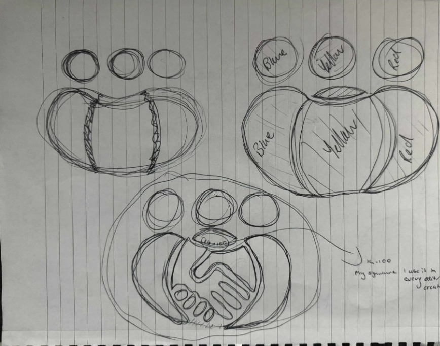
As I briefly mentioned in the logo sketch section, my main goal was to create an inclusive logo, which was the central idea. Therefore, I decided to make the focal point three people to showcase a collective of individuals working together. Once the main focal point was established, I felt something was missing; it lacked deeper meaning. So, I created the middle person with a handshake to highlight that the participatory collective is all about inclusiveness and collaboration to help others. It’s almost like a ‘helping hand.’ This blend of two different ideas ultimately created a significant yet simple meaning that emphasises the importance of collaboration, lived experiences, creativity, and the fair distribution of power between communities and researchers. I then refined it in Photoshop by adding a rough and worn-out texture to create contrast and show that, although it is an inclusive community, it still needs help from new researchers, volunteers, and people willing to get involved to finish polishing it into the best version. A small detail is that on the middle person, I added a small ’14-100,’ which you could say is my signature that I include in every single work I produce. The numbers represent the postcode of where I am from, and I find it adds a personal connection to the project.
I have also included a Branding standard to display the logo in real-world scenarios, while also demonstrating consistency and identity.
Storytelling Potential
I aim to create the Participatory Collective storytelling based on the idea that stories are made together with communities. Members of the community work together to shape narratives that mirror shared experiences while honouring individual viewpoints. By incorporating local dialects, visual symbols, and creative contributions from participants, we can ensure that the stories stay rooted in real-life experiences, avoiding the risk of becoming too institutional or academic.
A key challenge in this co-production process is finding unity without losing diversity. The storytelling approach in this design values differences not as problems to fix, but as important strengths. Instead of seeking agreement, it focuses on building connections by creating a shared narrative framework where various, sometimes conflicting, truths can exist side by side.
The storytelling aspect of the website design for the Participatory Collective can be shown by creating an engaging, multi-voiced digital space where communities can come together to create and share their own stories. The platform should act as a lively narrative that uses multimedia elements like videos, audio clips, images, and interactive maps to convey real-life experiences. Its structure should allow users to delve into themes like belonging, recovery, or youth well-being. Design features such as inclusive fonts, colour palettes, and layouts can promote empathy and connection, blending different voices without losing their uniqueness. By combining creativity, participation, and accessibility, the website itself transforms into a storytelling medium that reflects the Collective’s dedication to collaboration, fairness, and shared learning.
The key takeaway from this is that I want to try to represent this through a parallax effect that will make browsing engaging and interactive. The ability to have users scroll down and follow a story is challenging, but I believe that with a strong parallax, this becomes possible. This will encourage users to consistently return due to the strong connection it will create.
My Objectives For This Project
My personal objectives for this project are to centre the campaign around the concept of it being a collective, as I’ve mentioned several times. It’s about bringing together various perspectives and life experiences to create a unified whole that connects to ideas supporting our mission to empower communities by linking them with researchers to collaboratively develop innovative solutions. I can’t quite explain it, but after all the research I’ve done, I find myself pondering what the next generation will think of us. How will recovery, justice, and care be perceived in the future? That’s why I want to name the campaign ‘In Future We Trust.’ I believe this is a strong statement because I want something unique instead of a standard campaign. Rather than concentrating on the current state, it emphasises what could be if we believe and work together to improve. This idea lays a solid groundwork for moving ahead, enabling me to build around this concept and create something that aligns with the ideas of a collective approach.
A brief yet refined idea for the campaign ‘In Future We Trust’ is to engage all groups in a collaborative effort to create their ‘ideal’ future stories or artworks that envision a more compassionate and just society. We aim to display these in local communities, but primarily push them forward through short film content on social media to maximise traffic and engage as many people as possible. Over time, the group from the participatory collective that gains the most visibility and attracts new members will receive additional support. This is just a concise initial concept that aligns well with the campaign.
Figma Mood board with all of the research collected.
Image Reference
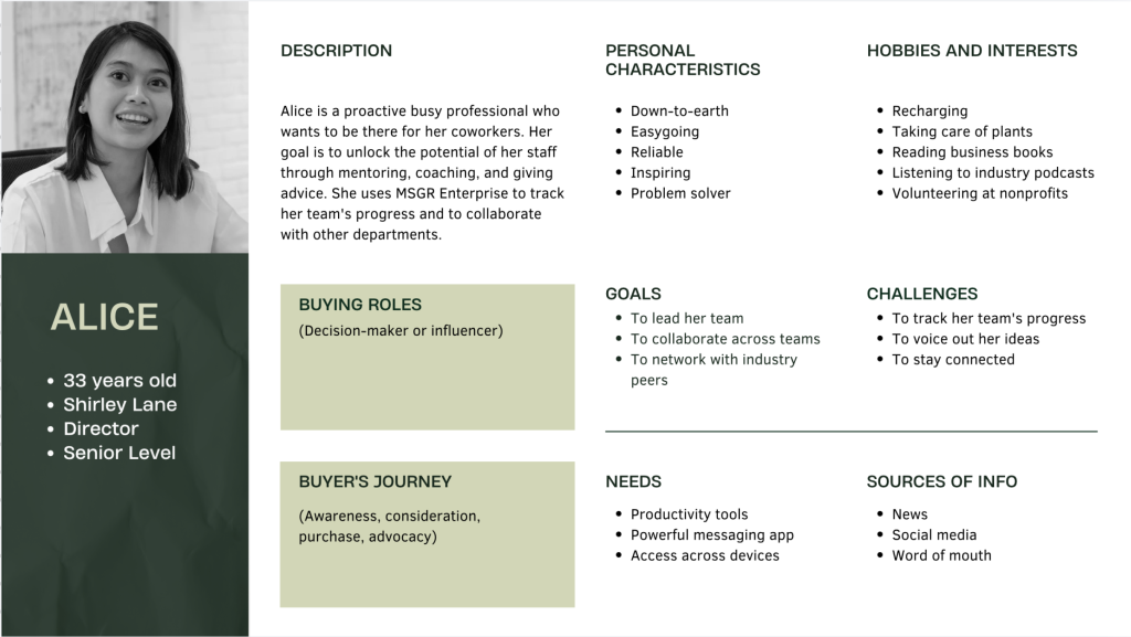
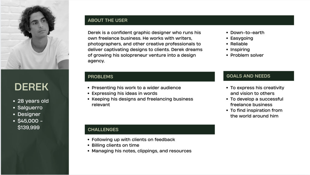
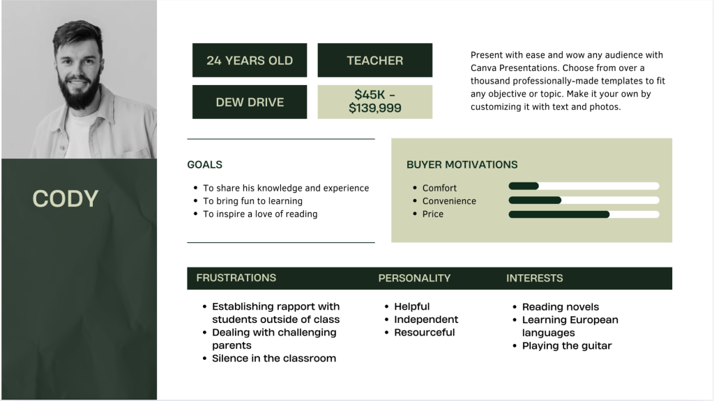
User Persona Images – Canva – Free elements (2025) [Photograph] https://www.canva.com/design/DAG2_7qzbpQ/SEOjO7e9oFnJKZ9RrLOtDA/edit
First competitor screenshot – Community Knowledge Matters (2025) – https://www.communityknowledgematters.com
Second competitor screenshot – Community Research (2025) – https://www.communityresearch.co.uk
Third competitor screenshot – Community Research Networks (2025) – https://www.youngfoundation.org/community-research-networks
Fourth competitor screenshot – Healthwatch (20250 – https://www.healthwatch.co.uk
Web design trends mood board – Organic oil website (2025) – https://www.google.com/search?client=opera&hs=End&sca_esv=cfc61a470e31a607&sxsrf=AE3TifPH6mVjV-Mly5tstN4bNHsWGLl9Gg:1761695896320&udm=2&fbs=AIIjpHxU7SXXniUZfeShr2fp4giZjSkgYzz5-5RrRWAIniWd7tzPwkE1KJWcRvaH01D-XIVq8GTSVeX03zdmjcvv_uucX31r6B_fyEmxe3wX1bmDzXOcvJdisMxnCsMPzAt5VFUD_28GE12EZHgnlA6G-WX_f4K4jhjOEqsJ7eC_wZ7ih-NvwaIdKSRLgXJ_tjeIKfGJfTJwx95QwaQteULRfS1rrsVSzw&q=eclipse+by+lilly+organic+oil&sa=X&ved=2ahUKEwiF1ujQjMiQAxVsYEEAHUbkAGAQtKgLegQIFBAB&biw=1866&bih=911&dpr=1#vhid=Uvum2CJvhuRRqM&vssid=mosaic
Web design trends mood board – Oakley x Axiom (2025) – https://www.oakley.com/en-us/l/axiom-space
Web design trends mood board – 34 website illustration designs that bring brand stories to life (2025) – https://99designs.com/blog/creative-inspiration/website-illustration
Web design trends mood board – Firewatch (2025) – https://www.firewatchgame.com
Web design trends mood board – I AM NOT A BOT (2025) – https://imnotabot.sangyoungbae.com
Web design trends mood board – Edoardo Lunardi (2025) – https://www.edoardolunardi.dev
Web design trends mood board – HUT 8 (2025) – https://www.hut8.com
Web design trends mood board – Swaraj – Portfolio (2025) – https://portfolio-25-phi.vercel.app
Web design trends mood board – Zip Voyager (2025) – https://zipvoyager.com
Type fonts – da font (2025) – https://www.dafont.com
Colour extermination – Coolors (20250 – Coolors
Reference
Investopedi – Mission Statement: How It Works and Examples (2025) – https://www.investopedia.com/terms/m/missionstatement.asp [Accessed 27/10/25]
OSHI – OPEN SOURCE HEALING INITIATIVE (2025) – https://www.oshi.org.uk [Accessed 27/10/25]
Butterflies – Memory lost group (2025) – https://www.butterflies.org.uk [Accessed 27/10/25]
Youth Aspiration Connect -Youth Aspiration Connect (20250 – https://youthaspireconnect.org.uk [Accessed 27/10/25]
The Ideas Fund – The Ideas Fund (2025) – https://theideasfund.org [Accessed 27/10/25]
Future Processing – Ethical design: principles, benefits and examples (2025) – https://www.future-processing.com/blog/ethical-design-principles-benefits-and-examples [Accessed 28/10/25]
Medium – Getting started with design ethics: A curated resource list (2022) – https://kate-every.medium.com/getting-started-with-design-ethics-a-curated-resource-list-f3dac43d6762 [Accessed 29/10/25]
Future Processing – Storytelling in design: the secret role of narrative (2025) – https://www.future-processing.com/blog/storytelling-in-design-the-secret-role-of-narrative [Accessed 28/10/25]
Medium – Storytelling for Designers (2018) – https://uxdesign.cc/storytelling-for-design-8dc38c57cf23 [Accessed 28/10/25]
Sproutsocia – The complete guide to social media campaigns (2024) – https://sproutsocial.com/insights/social-media-campaigns [Accessed 28/10/25]
Socialsellinator – Social Campaigns Explained: Everything You Need to Know (2024) – https://www.socialsellinator.com/social-selling-blog/a-social-campaign [Accessed 28/10/25]