The ‘Clout Corner’ is a niche concept store where music and fashion collide. Built for young people ranging from 16 to late 30s who live and breathe hip hop from gritty underground releases and raw, distorted sounds to the biggest mainstream CDs alongside clothing that represents it too.
Animated logo
Logo Animation 1 – https://youtube.com/shorts/pXMv32pToLU
When it came to the logo animation my aim was to make the brand the priority and use the colour palette to its full advantage. My thought process was to keep it simple but clean so I used scaling and 3D transforms in After Effects to create a zooming effect. I then applied easy ease and a Gaussian blur to achieve smooth motion that grabs the viewer’s attention from the start ensuring the brand identity was the focal point throughout.
Logo Animation 2 + Sound – https://www.youtube.com/watch?v=_4-ocQJ4Z8c
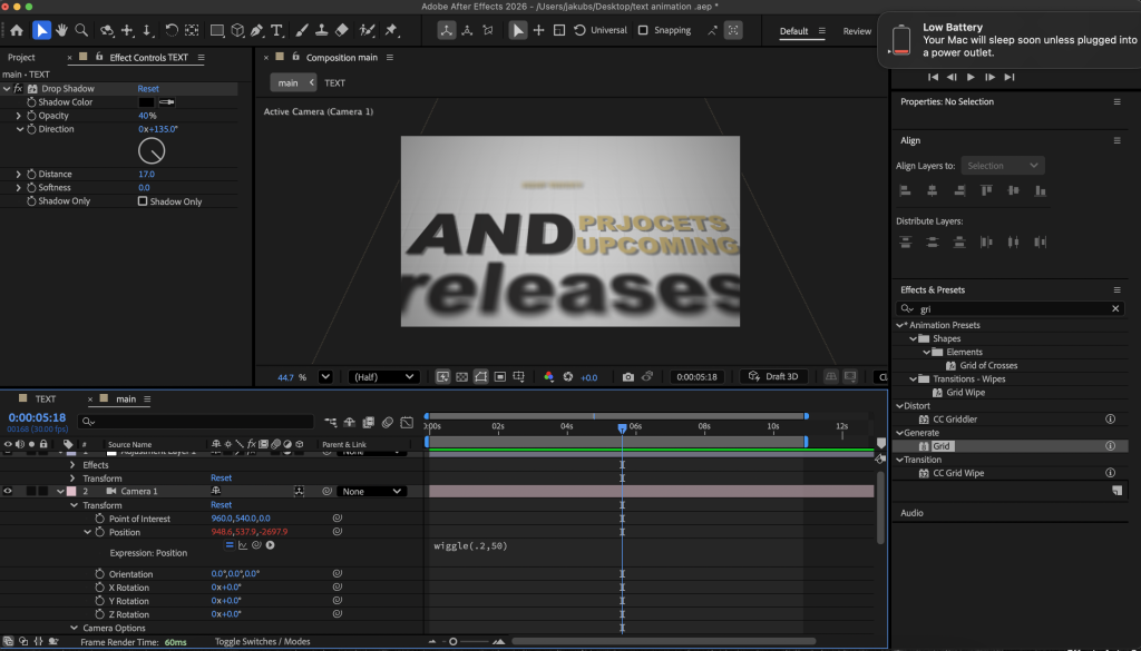
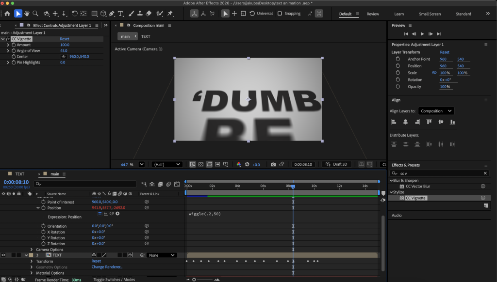
Animated Typography
Animated Typography – https://youtu.be/evaAq0WTFGw
For the typography animation consistency was again at the forefront of my thinking. I wanted the text to feel followed and purposeful, so I used the camera effect and worked with a 3D composition to add depth and movement. On top of that, each word has its own scaling animation, which added a significant number of layers and made the project increasingly difficult to manage. I also applied drop shadows and subtle Gaussian blur across the text to elevate the overall feel and bring it closer to a professional standard.
One thing I would need to be more careful about and would change if approaching this animation again is layer management and naming the layers. The lack of organisation added many unnecessary extra steps as I had to rearrange everything repeatedly making very time consuming.
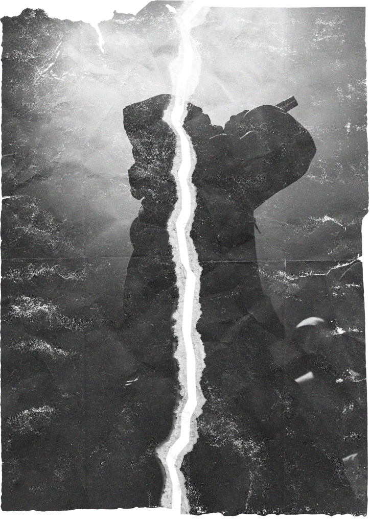
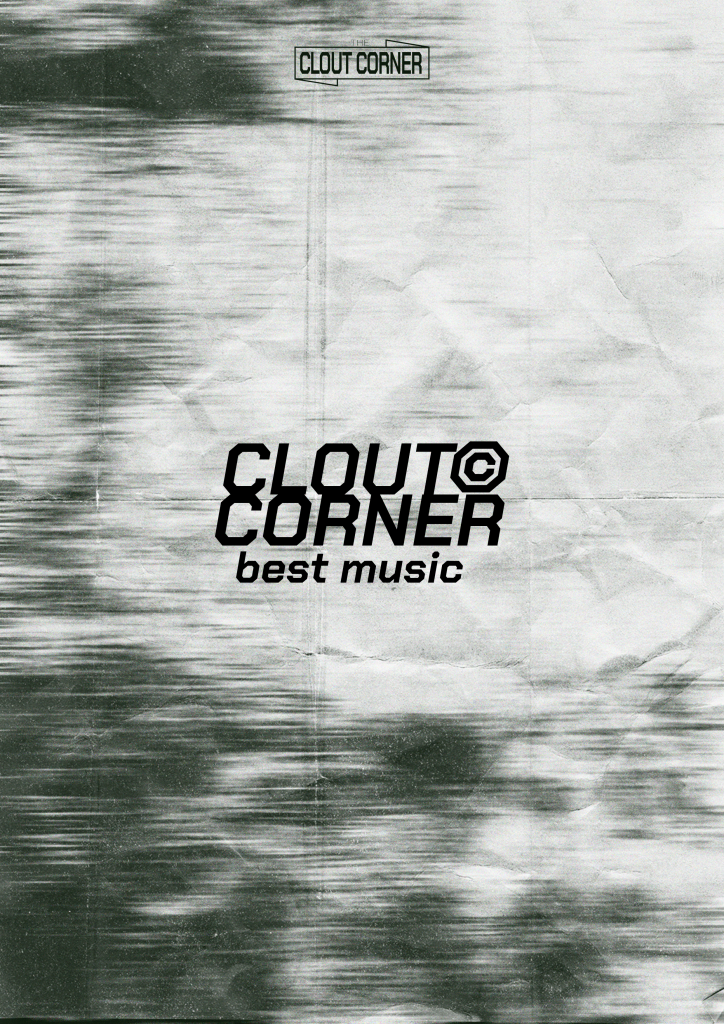
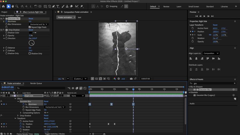
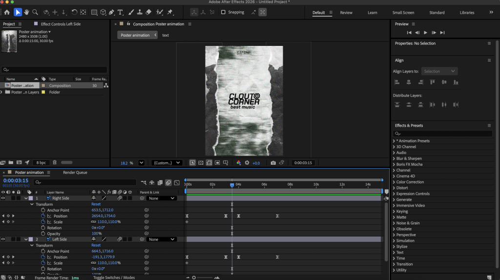
Animated Poster/InfoGraphic
Animated Poster – https://www.youtube.com/shorts/3cBk7NKCk0Q
Finally, for the infographic I started off in Photoshop creating the actual poster itself. My idea was to create an almost transition like animation where you rip a paper apart to reveal content inside. The key tool that made this work was positioning ensuring both sides of the paper moved symmetrically while revealing the information. I experimented a lot with different blurs and shadows as the paper opens it loses resolution, and as it begins to close the background follows adding that extra layer of realism. Overall I am very proud of this animation as through the process I grew to understand After Effects far more deeply.
Carousel – https://www.youtube.com/shorts/gdWN4-N1PWo
Reference
All Images Used sourced using Unsplashed and Adobe Stock
Unsplahsed – hip hop (2026) https://unsplash.com/s/photos/hip-hop [Accessed 30/04/26]
Adobe Stock – hip hop (2026) https://stock.adobe.com/uk/search?k=hip+hop+&search_type=usertyped [Accessed 30/04/26]