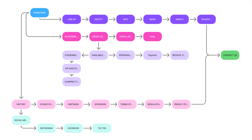
First thing I have done when it come to creating a mid fidelity design I went on to create a flow chart to have a rough idea of what acutely need to go on the website and the app this has sent and very effective starting point of implementing more info to the mid fidelity design.
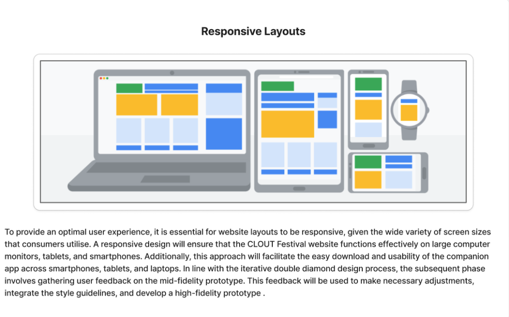
Then I went on to focus and asses the possible composition and responsive layout to both the app and website.
To provide a smooth user experience website layouts must be responsive given the wide variety of screen sizes that consumers use. A responsive design will enable CLOUT Festival website to function effectively on large computer monitors tablets and smartphones. Additionally, this approach ensures that the companion app can be easily downloaded and utilised on smartphones, tablets and more.
Mid Fidelity Design.
One of the key components that enhance user experience design is the call-to-action (CTA) buttons. These buttons serve to engage viewers and provide answers to any questions they may have regarding the product service etc . In this instance, I have developed several responsive CTA designs aimed at encouraging users to explore the possible tickets of the CLOUT Festival and consider all of the possible options . The tone employed in these calls to action is crucial; a creative and casual approach can leave a lasting impression and motivate users to engage more frequently with the festival’s offerings.
Additionally, it is essential for CTAs to stand out from other design elements through the use of appropriate typography and contrasting colours. According to the colour theory, the ideal application of colour for CTAs is to use it as an accent comprising 10% of the overall palette and althought in this prototype I have not used the full colour pallet I started to plan out where what colour goes for this theory to work and to ensure visibility on the website.
To further enhance functionality the buttons is designed to change colour when hovered over signalling to users that it is clickable and meant for interaction. Clearly indicating points of interaction is vital for user experience any shortcomings in this area can hinder navigation and limit access to features ultimately negatively impacting both user experience and user interface.
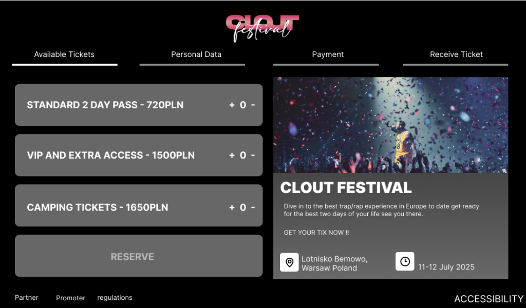
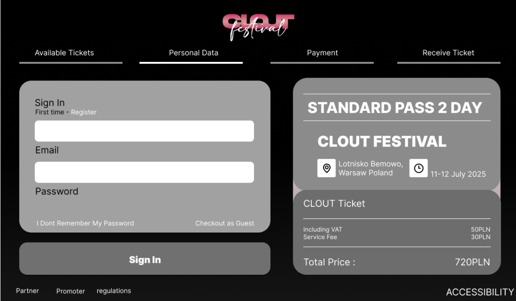
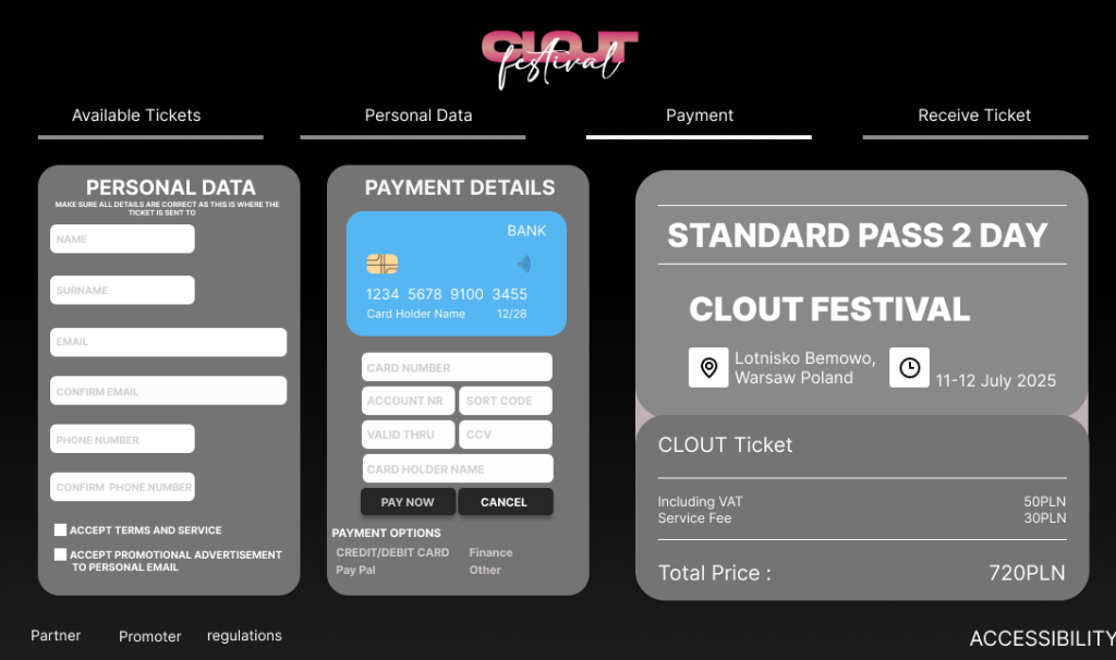
Although I have begun to incorporate greater depth and detail into my mid-fidelity prototype by adding more features it still requires significant development. Consequently, I have not yet utilised the entire colour palette previously assigned as I aim to finalise all the features that will be included in both the website and the app. This means I need to refine the design further to enhance its visibility for users. Specifically, the layout must be optimised to achieve the ideal ratio of visible aspects that are crucial to other features, such as accessibility.
References
Interaction Design Foundation – IxDF (2016) What is user centered design (UCD) https://www.interaction-design.org/literature/topics/user-centered-design [Accessed 8/4/25]
Material Design – Responsive Layout Grid (2024) https://m2.material.io/design/layout/responsive-layout-grid.html#breakpoints [Accessed 8/4/25]
BrowserStack – How to create a Responsive Website (2024) https://www.browserstack.com/guide/how-to-create-responsive-website [Accessed 9/4/25]
Medium – Learn more about plotting responsive layouts (2023) https://osamaabdelnaser.medium.com/learn-more-about-plotting-responsive-layouts-9df5513acdc6 [Accessed 9/4/25]
Image References
First Page of the prototype – BIG idea – Event Agency (2024) [Photograph] https://www.big-idea.eu/en/clout-festival.html[Accessed 20/3/25]
Responsive layout Figma post – Osama Abdelnaser [Edit/print] -Medium Learn more about plotting responsive layouts https://osamaabdelnaser.medium.com/learn-more-about-plotting-responsive-layouts-9df5513acdc6 [Accessed 9/4/25]