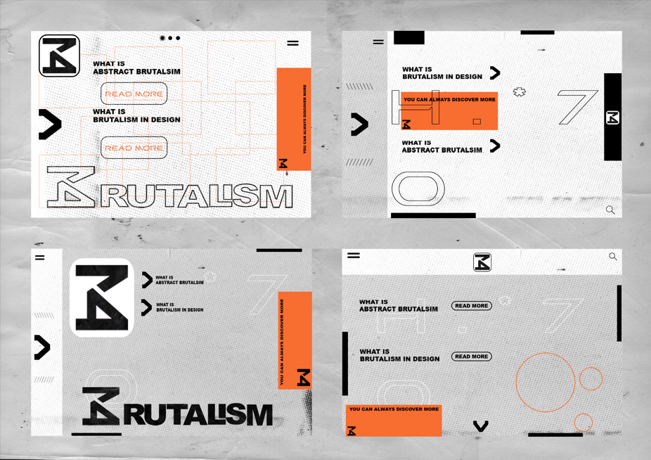
At this point, I had almost everything in place to start making the final web pages I had the logo set and ready I completed full ‘brand standards’ for this project meaning I had a set colour pallet set amount of fonts that I wanted to use etc and like I said I want to treat this whole project like a real web design from scratch instead of making a tradition informational page I went on to created 4 potential variations/experiment with the potential layout composition etc based on all of the work that leads to this point.
First Page
For the very first idea, I went for a simple white background with different symmetrical bold highlights/elements in the background like supers to keep the theme of brutalism again here I just wanted to implement the logo somewhere so you can see the brand when you are on the web I wanted to clearly show what the web has to offer so with two big subtitles and instruction on what to do to move on to the next page then I just went on to add more and more elements to make it look more like a web page and at the end, I added a new pattern to roughen the look of the page so It looks like brutalist buildings.
Second Page
For the second page, I wanted to certainly include some greyer to represent the idea of the use of concrete in brutalist architecture. I also thought that the previous development had too much going on in the background so I decided to make this one a bit more simple by removing the squares in the background and made the whole thing minimalistic witch I found to work very well creating a clean aesthetic
Third Page
The third one is my favourite and most of the feedback I got was similar I think it is because overall this one has the most amount of grey which I just find to perfectly work in this situation as it is a perfect representation of brutalist architecture colours but also the contrast with the orange just make it pop making it pleasant to look at and you just want to stay there I found that the minimalistic look was a bit more successful than the first page I decided to once more go with a bit less in the background with two subheadings of what the web has to offer.
Forth Page
This one is, in my opinion, also very successful as its everything a web needs when it comes to aesthetics you have everything very accessible and minimalist I found it to be a bit more successful on a mobile device as a phone screen is smaller meaning you do not want to much information to overwhelm and we live in a time where short and small things get much more attention that overwhelming amount of information. This was my main inspiration when it came to making the mobile web pages.
Reference
RIBA Architecture (2024) – Brutalism – https://www.architecture.com/explore-architecture/brutalism#:~:text=Brutalism%20in%20architecture,construction%2C%20producing%20highly%20expressive%20forms. [Accessed 19 December 2024]
PlayBook Digital (2024) – Typography in Brutalism – https://www.playbook.com/blog/brutalism-in-graphic-design/#:~:text=Typography%20and%20font,challenging%20established%20notions%20of%20beauty. [Accessed 19 December 2024]
99Designs (2024) – Brutalism in design: its history and evolution in modern websites – https://99designs.com/blog/design-history-movements/brutalism/ [Accessed 19 December 2024]
The Art Story (2024) – Brutalist Architecture – https://www.theartstory.org/movement/brutalism/ [Accessed 19 December 2024]