My investigation and project are based on abstract brutalism and its impact on the graphics world. I wanted to use its elements and characteristics to showcase an entire development process in creating a web page, therefore, I started by making the logo for the ‘brand’ once that was done I established the overall theme, colours, fonts I want to use in the development of my three web pages like I said I want the whole project to be like one big working process that finally leads to the web page so I started by creating three Graphical standards that show my choices.
First Page
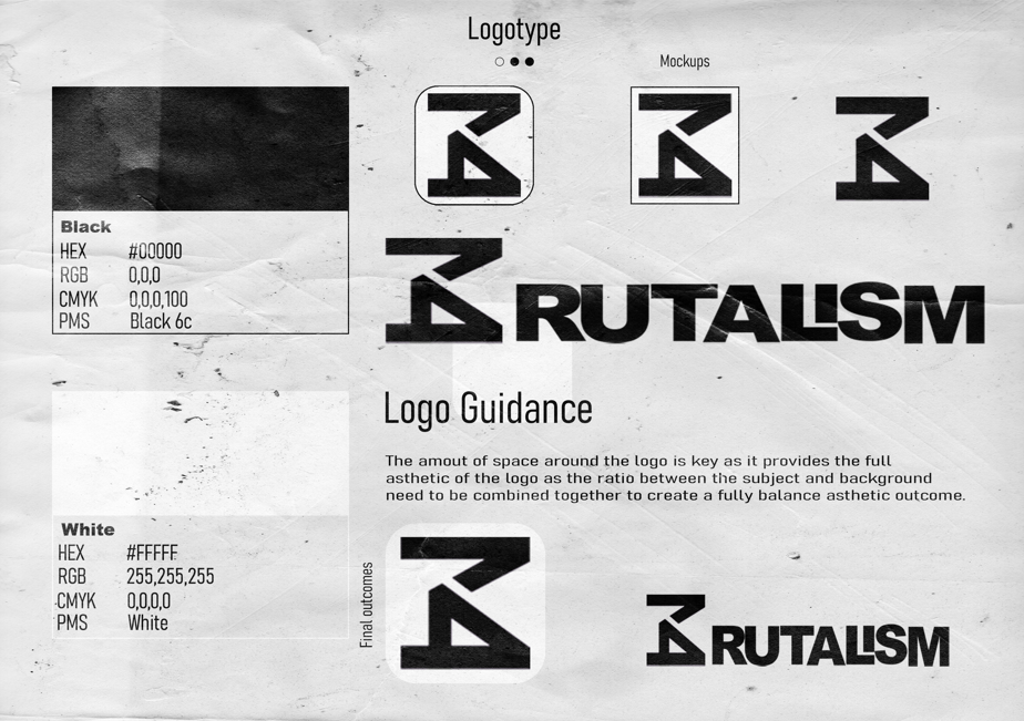
I was fully focused on showcasing the logo for the ‘brand’ The whole idea behind this logo was to implement the number ’14’ I tray and implement this in every piece as this is my way of tagging my work but this is also part of the postal code I am from which I take a lot of pride in. I turned the 14 to look like ‘B’ so it links with ‘B ‘ritualism but also adds a bit more meaning when you look at it clearly you can also see the letter ‘K’ which is the first letter of my name. You can see the colours used on the left with a clear specific description of the shade etc there is a section to show different initial ideas and mockups and a small section to give some background for the logotype, at the bottom I decided to show the final idea I went for.
Second Page
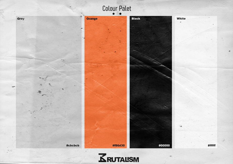
This was the toughest page to complete as at this moment I did not have a clue on how I wanted the web page to look I just had a rough idea of the themes and knowledge of brutalism to come up with a colour pallet I decided to stick with both shaded of white and black as you can go wrong with it but also this works with the idea of harsh concrete architecture form brutalism as there’s always some black and white. Not only that when you think of brutalism you see those massive unique and stupendous amounts of concrete so I went for a grey colour to highlight this idea I decided to stick with a lighter shade of grey to reach a harsher contrast between black and grey. This colour combination seemed very blank so I wanted to add a vibrant contrast that would highlight those 3 colours but I did not want to lose the brutalist style. Then so I went for a very popular orange during World War 2 arts as this is when brutalism emerged.
Third Page
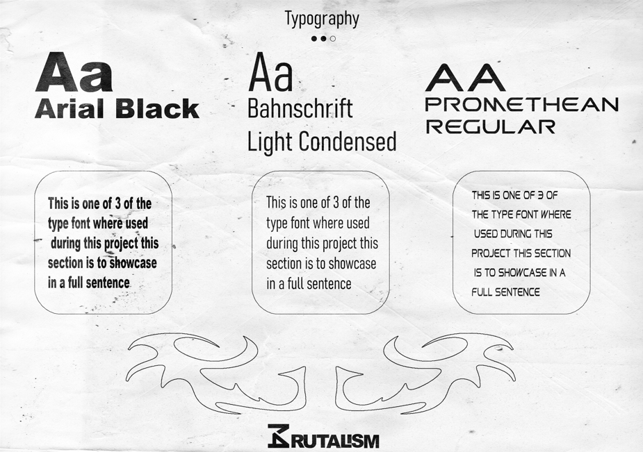
Finally, this was just the formality I wanted to finish off with a page to show the fonts(typography) I am planning on using the first and the main one is ‘Arial Black’ a classic that you can go wrong with I was keen on using this one as it big bold and symmetrical and this just goes hand in hand with brutalism and the whole movement. The second one is ‘Bahnschrift Light Condensed’ I just found this thin font to be a nice contrast to the bold Arial font. The last one I went for something a bit more interesting for finishing touches which is ‘Promethean Regular’.
Reference
RIBA Architecture (2024) – Brutalism – https://www.architecture.com/explore-architecture/brutalism#:~:text=Brutalism%20in%20architecture,construction%2C%20producing%20highly%20expressive%20forms. [Accessed 19 December 2024]
PlayBook Digital (2024) – Typography in Brutalism – https://www.playbook.com/blog/brutalism-in-graphic-design/#:~:text=Typography%20and%20font,challenging%20established%20notions%20of%20beauty. [Accessed 19 December 2024]
99Designs (2024) – Brutalism in design: its history and evolution in modern websites – https://99designs.com/blog/design-history-movements/brutalism/ [Accessed 19 December 2024]
The Art Story (2024) – Brutalist Architecture – https://www.theartstory.org/movement/brutalism/ [Accessed 19 December 2024]