Recap
In this project, my job was to develop a mid-fidelity prototype and begin the process of establishing a real website domain for Participatory Collective.
Participatory Collective (PC) is a network made up of community groups, individuals, and organisations in Hull and East Yorkshire. It was formed to unite people in order to shift power, transform systems, and help communities thrive in a friendly, fair environment. PC began with Ideas Fund projects, but now invites anyone interested in working in a relational, participatory, ethical, and human-centred manner. This approach focuses on placing people’s knowledge and experiences at the core of decision-making – not just doing things for communities, but collaborating with them.
My personal objectives and vision for this project are to focus the campaign on the idea of it being a collective, as I’ve mentioned multiple times. It’s about uniting different viewpoints and life experiences to form a cohesive whole that connects to ideas that support our mission of empowering communities by linking them with researchers to jointly create innovative solutions. I can’t fully articulate it, but after all the research I’ve conducted, I find myself reflecting on what the next generation will think of us. How will recovery, justice, and care be viewed in the future? I think this is a powerful statement because I want something distinctive rather than a typical campaign. Instead of focusing on the present situation, I want to highlight what could be if we believe in and collaborate to make improvements. This concept provides a strong foundation for moving forward, allowing me to build around this idea and create something that resonates with the principles of a collective approach.
One important thing I want to highlight throughout the entire project is the storytelling element of the website design for the Participatory Collective. I aim to achieve this by creating an engaging, multi-voiced digital space where communities can unite to create and share their own stories. The platform should serve as a vibrant narrative that incorporates multimedia elements like videos, audio clips, images, and interactive maps to express real-life experiences. Its layout should enable users to explore themes such as belonging, recovery, or youth well-being. Design aspects like inclusive fonts, colour schemes, and layouts can foster empathy and connection, blending various voices while maintaining their individuality. By merging creativity, participation, and accessibility, the website itself becomes a storytelling medium that embodies the Collective’s commitment to collaboration, equity, and shared learning.
Site Mapping/Hierarchy + Structure
To start creating the prototypes, I began by mapping out the site. This is a crucial step for building the most optimised website for search engines because it provides a clear roadmap of your site. It helps search engines find all the pages you want to be indexed and shows which pages are the most important. Additionally, a site map is a great way to organise the hierarchy of the site. It takes into account visual elements like size, colour, and contrast, along with the logical arrangement of content, to highlight what matters most. This helps users quickly and efficiently find what they need. Essentially, it’s like a blueprint for the website. A well-planned site map creates a clearer structure and navigation system by outlining what content should be included. It also allows you to evaluate exactly what users need, which enhances their experience by ensuring they have everything they require. (see below)
Site Mapping + Hierarchy (Link)
Another important factor that motivated me to create a site map was to establish a blueprint along with rules and regulations that would enable me to incorporate a story later in the design. My goal is to develop participatory collective storytelling based on the concept that stories are created collaboratively with communities. A major challenge in this co-production process is achieving unity while preserving diversity. This storytelling approach values differences not as issues to resolve, but as significant strengths. Therefore, I went on to create several sub-sections for the site map that feature quotes, reviews, and other contributions from people involved in the participatory collective.
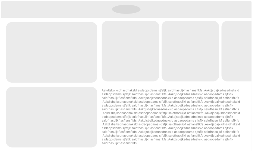
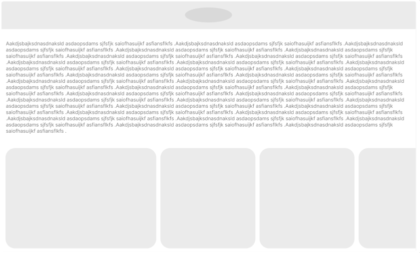
Low Fidelity Wireframe
A low-fidelity wireframe is helpful because it allows me, as the designer, to concentrate on the structure and user flow of a website without being side tracked by visual elements. Since it’s quick and inexpensive to create, I can try out various layout concepts, identify navigation problems early, and make adjustments for further user research. It also aids developers and stakeholders in aligning on the main layout and functionality before diving into detailed design work. This early understanding saves time, minimises confusion, and avoids revisions later on. Low-fidelity wireframes are particularly crucial for UX and UI because they enable testing of how users will engage with a design before the visuals are completed. For UX, they help uncover issues with flow, clarity, and usability early, allowing you to address problems before they become ingrained in the final product. For UI, they offer a straightforward blueprint that indicates where elements should be placed, ensuring consistency and a logical hierarchy without the distraction of colours or styles. Overall, they lay a strong foundation so that both the experience and interface can develop in the right direction from the beginning. Additionally, this was a great way to start incorporating my idea of a participatory collective, where stories are created together with communities. Community members collaborate to shape narratives that reflect shared experiences, as I was able to begin assessing and experimenting with where certain aspects should be positioned.
Initial Low Fidelity Wireframe Ideas
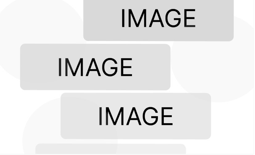
As I mentioned, low fidelity is meant for experimentation. As you can see, my initial pages weren’t that great based on the feedback from peers. The main takeaway was that they seemed overcrowded with too many different cues at once. Therefore, I decided to remodel the entire wireframe. (see below)
One thing that I think was a turning point in the development of the wireframes was deciding to use Figma kits. Using kits for design is better because they provide a ready-made set of components that adhere to best practices. This means I don’t have to create everything from the ground up, which saves a lot of time and keeps my design consistent across all pages, almost making it look more professional. This allows me to focus on ensuring that the Participatory Collective is the main subject, as I can dedicate more thought to arranging the further prototype.
Figma kits also help you stay in line with modern UI patterns, so your site appears clean, professional, and user-friendly. Since the components are reusable and customizable, they enhance collaboration between designers and developers, making it easier to maintain or update the design later. Overall, Figma kits improve efficiency, consistency, and quality all at once.
Along with everything else, this is when I began to focus more on ethical design. Both ethical and sustainable choices in design aim to create products that honor people, their time, and their various needs. Because of this, I created both a mobile and desktop wireframe to reach a larger audience and consider users’ needs, as some users might not be able to access Participatory Collective through a desktop or may not have the time to.
Mid Fidelity Wireframe
All of this was just the build up to the main task witch was creating a mid fedality prototype. A mid fidelity prototype is important because it bridges the gap between rough ideas and polished design. It adds more detail than a low fidelity wireframe like clearer layouts, real content placement, and interactive flows so we can test how the product actually behaves without investing full effort into visuals yet. This level of detail helps identify usability problems earlier, letting designers refine structure, pacing, and hierarchy before things get locked in.
It’s also valuable for communication and collaboration. Mid fidelity prototypes give stakeholders and developers a realistic sense of how users will navigate and interact with the design, making feedback more accurate and grounded. Because mid fidelity prototypes are still easier to change than high fidelity designs, they support fast iteration while ensuring the concept is solid, consistent, and ready for final visual design.
To start off, I wanted to come up with a concept for the visual aspects of the website. I had a rough initial idea of the main elements, and I thought about designing the whole look like an elevator. What I mean by this is that when you land on the homepage, it feels like you’re going through an elevator to access the content and main parts of the website. The idea of an elevator usually has a positive vibe, linked to progress, advancement, and ease, since its main job is to lift people or things to higher levels I believe this is a great way to show the story of Participatory Collective, as it drives progress and advancement through lived experiences, almost like an elevator. Once I got that sorted, I started thinking about the navigation logic, focusing on a mid-fidelity prototype. This stage is all about showing how users navigate through the website in a realistic, yet not fully polished way. Here, I want to outline the main pathways, like how a user moves from the homepage to important pages, how menus open or close, and how buttons function. This helps test if the navigation feels intuitive, if users can quickly find what they need, and if any steps seem unnecessary or confusing.
It also aids in mapping out UI patterns and both primary and secondary actions. By setting this logic early on, before diving into high-fidelity visuals, you make sure the flow is smooth, predictable, and consistent, which boosts both usability and the final UI design. From a UX perspective, having solid navigation logic in a mid-prototype makes it easier to check if users can actually find what they need and complete tasks without getting confused. Since the prototype is interactive, you can catch issues like dead ends, unclear labels, or crowded menus early on. This results in smoother user journeys, fewer cognitive load issues, and a more intuitive overall experience before the visual design even kicks in. In UI, navigation logic affects how components are arranged, prioritised, and reused throughout the interface. It helps define layout structure, spacing, menu behaviour, and which elements should stand out visually. By establishing navigation patterns at the mid-fi stage, the final UI becomes more cohesive.
Walkthrough
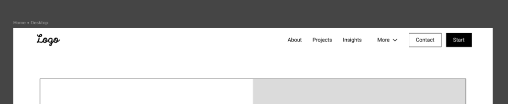
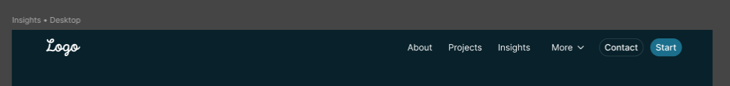
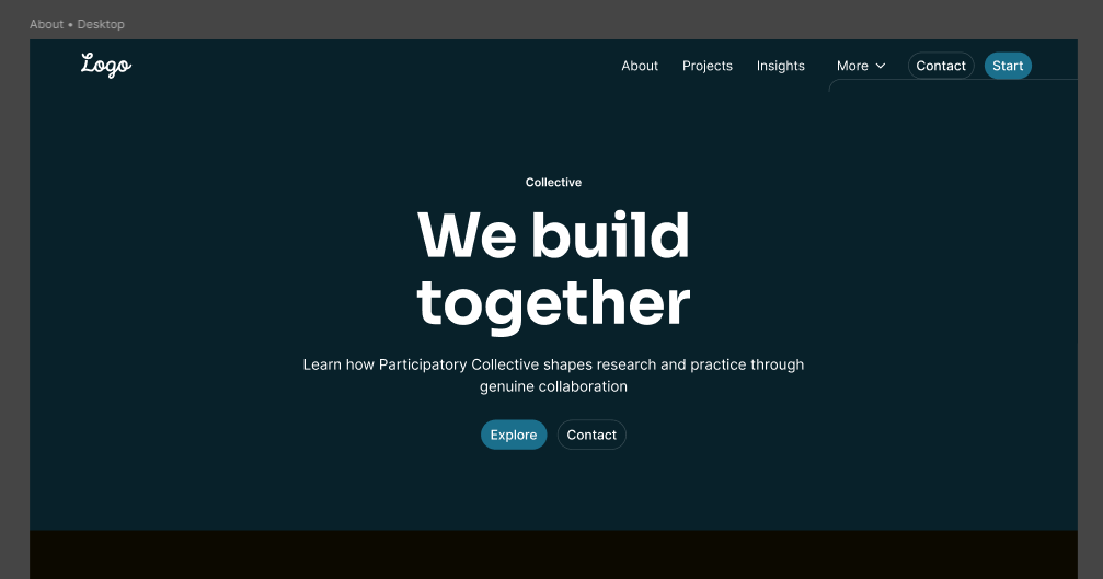
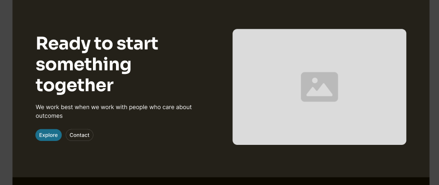
I chose a simple header because I didn’t want to use the burger menu. It makes things harder to find since the menus are hidden. I wanted to make them more noticeable, reducing cognitive load so that users can get what they need right away.
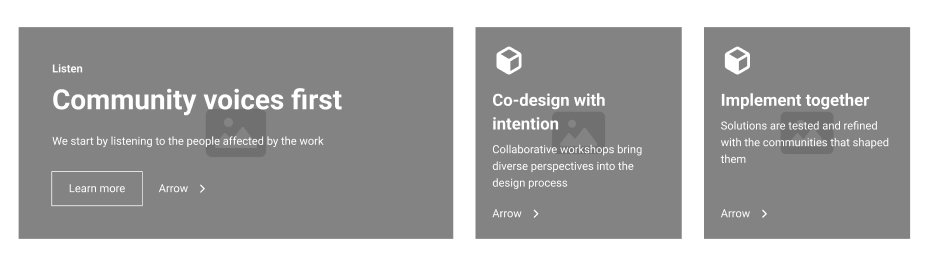
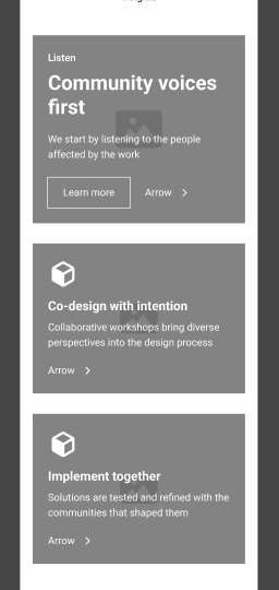
I wanted to make sure that all elements present on the website are easily accessible with a clear layout, so users can find what they need as quickly as possible. I ensured that all the small elements throughout the prototype have the same layout, featuring a large heading to catch attention, a smaller heading briefly describing what it is, and a big button that says ‘Learn more’ which takes you further into a specific section.
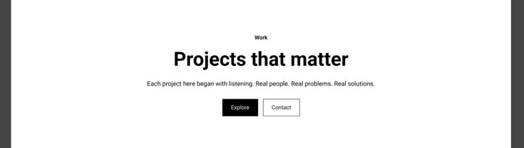
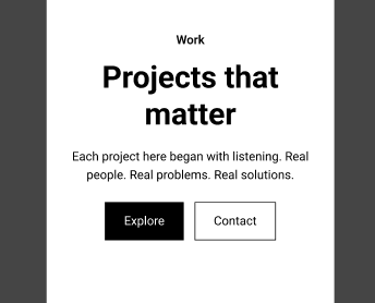
At the top of every page, I included a large call-to-action (CTA) with plenty of contrasts to make it stand out as much as possible. This is meant to enhance engagement, boost conversions, and direct user behaviour since it grabs their attention immediately.
Every minor adjustment or modification was executed with the purpose of preserving the narrative of the Participatory Collective. Narrative component of the Participatory Collective’s website design can be illustrated by establishing an interactive, multi-voiced digital environment where communities unite to create and share their personal narratives. The platform ought to function as a vibrant narrative that incorporates multimedia elements such as videos, recordings, images, and interactive maps to express authentic experiences.
Its framework should enable users to explore themes such as belonging, recovery, or youth well-being. Design elements like inclusive fonts, colour schemes, and layouts can foster empathy and connection, harmonising diverse voices while preserving their individuality. By merging creativity, participation, and accessibility, the website evolves into a storytelling medium that embodies the Collective’s commitment to collaboration, equity, and collective learning.
Accessibility
Making all of these decisions was crucial because I wanted to keep users happy. I ensured that user cantered design, often called UCD, highlighted the importance of understanding the genuine needs, preferences, and limitations of users. Ethically, this approach respects the autonomy and well-being of users. A great example of this method is testing prototypes with real users and taking their needs and desires into account. Therefore, I gathered as much feedback as possible, tested, and listened to different users. One of the main takeaways was that it lacked accessibility and tone. The feedback suggested that I should try to make users feel more welcome. This point really stood out to me because this could be beneficial for users with disabilities or various disorders, since this is closely related to Participatory Collective. Consequently, I worked on developing a more engaging way to present information and made the language more appealing. More importantly, I redesigned the prototype in dark mode, as it reduces strain on the eyes. Not only that, but this aspect also aligns with ethical design principles since dark modes consume less battery and emit less blue light. This is part of sustainable web design, which focuses on minimising the environmental impact of websites.
After doing some quick research and assessments, I found that dark blue is a great choice for dark mode. It’s easier on the eyes compared to pure black, yet it still provides good contrast for text and UI elements. Lighter colours, such as white or pastel shades, really pop against it, which helps with readability. Additionally, dark blue gives off a vibe of professionalism and calmness. By using slightly different shades of dark blue for various sections or components, you can create a visual hierarchy without messing up the dark mode look, striking a balance between style and usability.
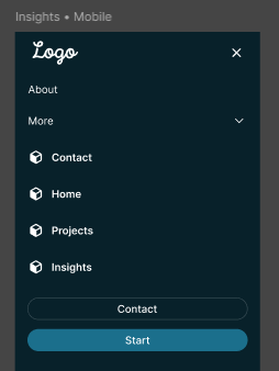
The navigation bar remains the same as in the light mode version, with the main pages positioned on the right to immediately show what’s in store, reducing the cognitive load on users and helping them engage more quickly with the services. For the mobile version, it’s once again identical to the light version, where right from the start, you have the main pages visible on the screen, leading to higher user traffic as they see it and click right away. I chose to keep the overall aesthetic similar to the light mode, only changing the CTA visuals to a slightly lighter blue compared to the rest of the website, achieving a more saturated contrast. A good CTA has a positive effect on user experience by clearly guiding users to the next step, minimising confusion and making interactions smoother. From a UI standpoint, a well-crafted CTA stands out visually through its colour, size, placement, and contrast, helping to establish a hierarchy and draw attention to key actions. Consistent styling of CTAs throughout the interface also enhances usability and ensures the design feels unified, boosting both functionality and visual appeal.
Style Guides For Wireframes
Style guides play a crucial role in prototypes as they maintain consistency and clarity throughout the design. They outline essential aspects such as colours, typography, buttons, icons, spacing, and how components behave, ensuring that every element of the prototype appears and feels unified. This uniformity allows users to quickly grasp patterns, enhancing usability and minimising confusion.
Style guides facilitate better communication, making it simpler to transfer designs to developers or modify components without causing mistakes. They also help save time by offering reusable elements, which support quicker iterations and establish a solid base for high-fidelity designs and the final product.
Sustainability in mid-fidelity prototyping is also key as it makes designs that are efficient, reusable, and adaptable, which helps save time and resources during the design process. By utilising consistent components, style guides, and scalable layouts, prototypes can quickly evolve as feedback is integrated, minimising the need to start over with each new version. It also means designing with accessibility and inclusivity in mind, ensuring that the prototype effectively serves a wide range of users. In summary, sustainable mid-fidelity prototyping emphasises efficiency, longevity, and ethical design choices, making the design process smarter and more focused on the user. However, when you place too much emphasis on this, you can lose your meaning. Therefore, it is also essential to keep in mind the story of Participatory Collective and continually refer back to it as a fundamental aspect of developing the relationship between the brand and its users.
Final Conclusion
As I’ve mentioned several times, my primary goal has been to transcend and uphold the Participatory Collective mission. This mission is rooted in the belief that stories are created collaboratively with communities, and that community members join forces to shape narratives through design. I want the project to truly reflect what it represents.
Working on this mid-fidelity prototype has been a crucial step in moving forward. This process let me concentrate on the main structure, navigation, and user flows without getting side tracked by the final visuals, which is really important for testing usability and functionality early on. By making wireframes and mid-fidelity layouts, I could spot and fix potential issues, making sure the user journey is smooth and that key interactions, like the call to action buttons lead users naturally to engage with the content. This organised method not only enhanced usability but also improved the overall coherence and hierarchy of the interface. Incorporating storytelling and user centred design throughout the prototype was another vital aspect. By keeping the user’s viewpoint in mind I made sure that the content, navigation, and interactive elements matched real needs and expectations. Using consistent Figma components kits helped keep visual unity while allowing for quick iterations, making it simple to include feedback . Their suggestions, especially about accessibility, tone, and visual inclusion, led to significant changes that boosted readability, navigability, and inclusivity, like better contrast in call to actions clearer labelling and adding dark mode. Sustainability in the prototyping process was also an important factor. Creating reusable components and scalable layouts allowed the prototype to develop efficiently, reducing wasted effort and resources, while ethical decisions in accessibility and inclusivity made sure the design effectively serves a diverse audience. The mid-fidelity prototype has allowed me to refine ideas, iterate carefully, and balance aesthetics, functionality, and user experience. It lays a solid groundwork for progressing into high-fidelity design and continuation of the assignment.
Run Through Prototypes (Videos)
Figma Kits – References
Materia Design – Community – Libraries – UI KITS – Material 3 Design Kit 2025 – https://www.figma.com/community/file/1035203688168086460 [Accessed 20/11/25]
Figma – Community – Libraries – UI KITS – Simple Design System 2025 – https://www.figma.com/community/file/1380235722331273046 [Accessed 20/11/25]
Apple – Community – Libraries – UI KITS – iOS and iPadOS 26 https://www.figma.com/community/file/1527721578857867021 [Accessed 20/11/25]
Ira Winterman – Community – Libraries – UI KITS – UI KITS 2025 –https://www.figma.com/community/file/1094903221888025808 [Accessed 20/11/25]
References
Dovetail – What is prototyping? 2025 –https://dovetail.com/product-development/prototyping [Accessed 21/11/25]
Medium – Enhancing Design Efficiency and User Experience: The Role of Mid-Fidelity Prototypes in Figma 2024 – https://medium.com/@carpioaltheadianne05/enhancing-design-efficiency-and-user-experience-the-role-of-mid-fidelity-prototypes-in-figma-0e14010404ca [Accessed 21/11/25]
Mailchimp – Learn the Difference Between UX vs. UI Design 2025 – https://mailchimp.com/resources/ux-vs-ui-design/?gclsrc=aw.ds&gad_source=1&gad_campaignid=22771402295&gclid=CjwKCAiA_orJBhBNEiwABkdmjO8EHT2xacVTZZmg_aU7S0gDaeR8QFgRH558Fl0lnHg8KqP-ne1DHxoC3JcQAvD_BwE [Accessed 21/11/25]
Th3design – The Good, The Bad, and The Beautiful: Navigating Ethical Web Design 2025 – https://www.th3design.co.uk/2025/07/navigating-ethical-web-design [Accessed 21/11/25]
Figma – What is prototyping 2025 – https://www.figma.com/resource-library/what-is-prototyping [Accessed 21/11/25]